While writing about subject pages and library websites the other day, it occurred to me that we might think of library websites in three stages – which emerged successively and continue to exist together. Always mindful of the rule of three 😉
We might clumsily call these stages: [1] fragmentary, [2] integrated supply, and [3] demand-influenced.
Fragmentary. Libraries have to manage a variety of resources which are outside their control and present them to their users as best they can. This has meant that the library website has often been a thin wrapper around two sets of heterogeneous resources.
One is the set of legacy and emerging systems, developed independently rather than as part of an overall library experience, with different fulfillment options, different metadata models, and so on (integrated library system, resolver, knowledge base, repositories, …). Another is the set of legacy database and repository boundaries that map more to historically evolved publisher configurations and business decisions than to user needs or behaviors (for example, metadata, e-Journals, eBooks, books, A&I databases, and other types of content, which may be difficult to slice and dice in useful ways). [Lorcan Dempsey’s Weblog – Stitching costs]
Integrated supply. Recently, libraries have been focusing on the website in a more holistic way, as a unified service. There are several developments which have supported this. One is the move to the single, or tabbed, search box as a focal point of the website. This may sit over a metasearch product, or, more recently, over a discovery layer product. Another is the adoption of a consistent content management framework which gives a similar look and feel across the website, extending to linked services (the catalog for example) where possible (I was interested to note that SOPAC and Ting both advertise the integration between the catalog and the rest of the website). Others include the integration of staff interaction capabilities (making relevent staff visible in appropriate places, including various ways of contacting staff or asking questions, …), and a consistent approach to developing subject or course pages. I discussed some examples of unified service provision in this post a while ago.
Given the fragmentation they face it is easy for libraries to see integration – the consolidation of supply – as an end in itself. However the real end is less the integration of information resources with each other than the integration of relevant information resources with the working patterns of their users. For this reason, we will begin to see more emphasis on sorting out demand as well as sorting out supply.
Demand influenced. I gave some examples recently of how sorting out demand is becoming more important. This of course touches on core library values, connecting users to appropriate resources in convenient ways. A specific example might be the Bookspace section of the Hennepin County Library website.
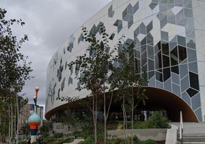
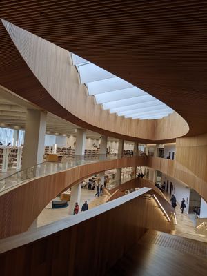
Looking at the North Carolina State University Libraries website the other day it also seemed to me that it provided a nice example of a site trying better to predict, meet and guide demand. As well as continuing to integrate the various sources of information supply. Here are a few things that occurred to me. As always, it is sensible to note that my impressions are those of an interested tourist rather than somebody who regularly uses the site ….
- Legible. The tabbed search box is centrally visible. Underneath this are three labels: Computing, Learning, and Courses. The first and second provide access to computing resources and learning spaces, respectively. The third provides information resources specialised to individual courses. The site is not cluttered with uncontextualised information resources, library administrivia, or brochureware.
- Relation of virtual to physical. This is an interesting emphasis. It is possible to book a room, to borrow computing equipment, to find out how many computers are in use. There is a service, Groupfinder, which allows you to alert others to your physical location in the library. Another is called, nicely, Tripsaver, and offers requesting/delivery options while allowing you to check status of request. There is a clock icon which links to a page of library opening times. A calendar of events is also published.
- Library staff and expertise are very visible and users are encouraged to make contact. Get Help and Ask Us links are visible at the top of the page. Alongside ‘help’ there is a link to an ‘expert’ in your area of study. Chat options are very visible. And users can offer Feedback on the site in general. Help with creating digital media is offered. There are links to the relevant library experts on course and resource pages.
- The website is not the only destination. There is a row of familiar icons at the foot of the page: Twitter, Facebook, RSS, YouTube, and Flickr. And there is a stream of news and tweets on the page. Of course, NCSU has also been a leader in mobile apps and there are several available.