
Prelude
Used consistently, this typographic vocabulary serves as the foundation for a successful identity system, communicating as much about the institution as the words used to describe it. // University Style Guide, Visual Elements. The University of Illinois Chicago
This is a short introduction to some topics around the design and deployment of fonts. I would like to prompt libraries to think a little more about an area that not only involves design choices, but also business and values choices. So I combine it with an exploration of fonts in use in libraries.
I hope to look at academic, public and some other libraries and library organizations in future posts. Given the role of fonts in relation to identity, I thought it would be interesting to look first at some national libraries.
A wonderful font will not save poor design work, and routine fonts can look well as part of an overall good design.
I am interested how library attitudes seem to contrast with, for example, university or corporate views. Many organizations invest considerably in branding, guidelines, and occasionally bespoke or custom fonts. Consider the fine custom font on the Clarivate website, for example. Or look at the way in which informed font choices at the Mellon Foundation or Ithaka websites support their storytelling. The University of Illinois, Chicago quote above is indicative of quite a common university sentiment even if it might seem over-stated.
There are many elaborate brand guidelines, in which typefaces play a role. Here is how New York University considers font contribution to its identity, looking at how different sizes and weights of its primary font Gotham (a sans serif, made famous by use in Barack Obama's election campaign) and serif Mercury can be used singly and together to express mood.
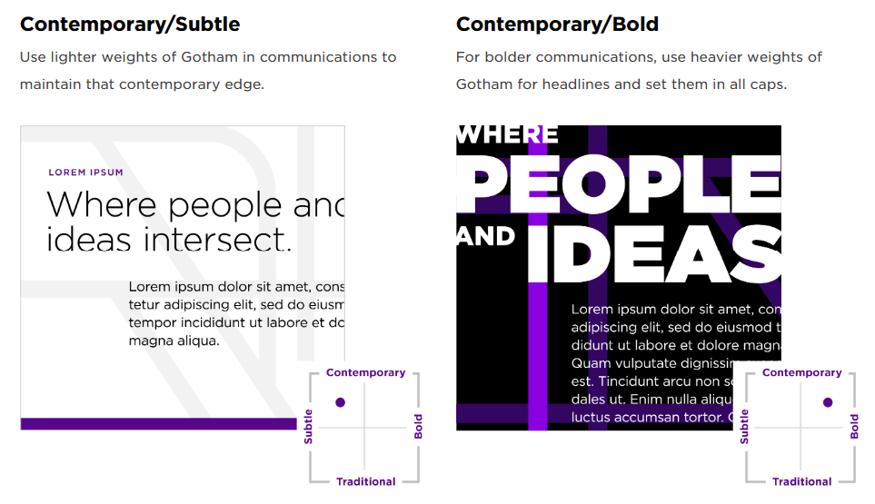
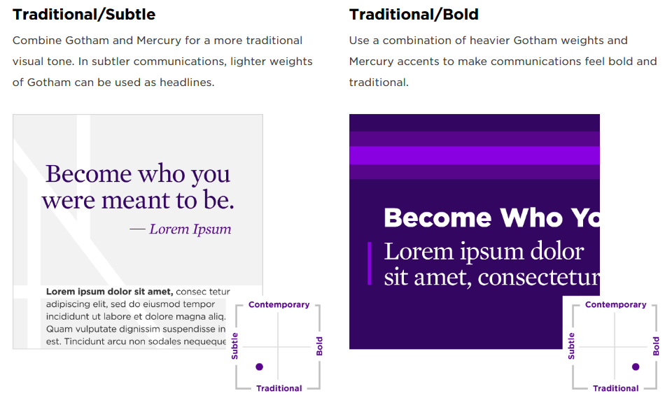
Gotham and Mercury combine in different weights to create different 'moods'
While it is easy to dismiss this as 'mere' marketing or undue corporate influence, identity is a subtle and influenceable attribute. Fonts play a very small part in this, but looking more closely at them can be intriguing and rewarding.
As I discuss below, it is important to remember that font selection and use is only one part of the overall typographic effect.
I was certainly surprised at the extent to which national libraries have adopted Roboto and the other top Google fonts. If you had to pick any organization that constitutionally was not aligned with a global monoculture then that organization might be a national library?
National: a national font?
The British have Gill Sans, the French, Garamond, the Italians, Bodoni, the Swiss, Helvetica. Is there a relationship between a typeface and place? Can a typeface have a regional accent? // There is no such thing as a New Zealand typeface, Kris Sowersby
This text accompanies an exhibition about typeface, place and New Zealand.
Sowersby is currently one of the world's leading type designers. He writes reflectively about his work and about type generally. He runs the Klim Type Foundry in New Zealand which has created several iconic modern fonts. You will have seen his fonts, if nowhere else, then certainly on ChatGPT. OpenAI uses Klim fonts Söhne ("Söhne is the memory of Akzidenz-Grotesk framed through the reality of Helvetica") and Signifier, a serif font.
The background for the remarks above is a font – called National – that Sowersby developed for New Zealand. The text above continues, and provides this context:
With a lack of digital typefaces to choose from, and motivated to create a typeface that local designers could use to communicate with rather than reaching for foreign ones, typeface designer Kris Sowersby began investigating a typeface that would be from New Zealand. It was first released in 2007 and was named National.
Now National is everywhere, especially here at home. [...] When we want to say “New Zealand”, we seem to reach for National.
The National typeface is used by the Museum of New Zealand Te Papa Tongarewa. However, I note it is not used by the National Library, which actually uses the very common Proxima Nova (the most widely used commercial font in the world according to its designer, Mark Simonson).
While National was successful and adopted in the way discussed above I wondered what was distinctively New Zealandish about it. Perhaps ironically, I was interested to see that it is the font currently used on the UK Parliament website.
Sowersby revisited these issues when writing about National 2, his later reworking of National.
With the re-drawing of National as National 2, I aspire to shed my original confused, pseudo-patriotic impulse and embrace and refine the aesthetic of the typeface itself. Because we live in a networked world where cultures are embraced and shared, designers use typefaces for their visual subtleties, aesthetic and inherent quality, not purely because of their geographic origin. // National 2 design information
There is a paradox about fonts: for something so visible, they are surprisingly invisible.
National libraries play an interesting role. They are service organizations, like other libraries, and want to provide effective interactive services. For this reason, they need a functional font which works well. They should also be interested in 'aesthetic and inherent quality.' However, they are also important national cultural institutions which may have a story and a point of view to be communicated. In that context, the font is one communicative device: it potentially communicates an atmosphere or accent, as discussed in the next section. Fonts are functional, but they also contribute to feeling and help tell stories. And sometimes, maybe for national institutions, they might have some local geographic resonance?
Atmosphere
There is a paradox about fonts: for something so visible, they are surprisingly invisible. Yet, any website or print designer working in the Latin script today has thousands of fonts to choose from. And they convey a message, albeit mostly subtly. As Kris Sowersby says elsewhere:
Having just said fonts are invisible, I do think typefaces have an atmosphere. You know, like Arial has a very perfunctory, staid atmosphere. It’s boring but it works. // Art Laureate interview, Kris Sowersby
I like the use of 'atmosphere' above to describe the distinctive contribution of a font. He also uses 'accent.' One also comes across the use of vibe, personality, mood, tone or flavor to suggest this. Typographer and lawyer, Matthew Butterick, refers to the 'seasoning' a particular font choice can provide.
This may be very subtle, and, by design, unobtrusive. Here are three examples, showing how fonts can unobtrusively yet effectively help a website work well and also how they can make a more explicit statement.
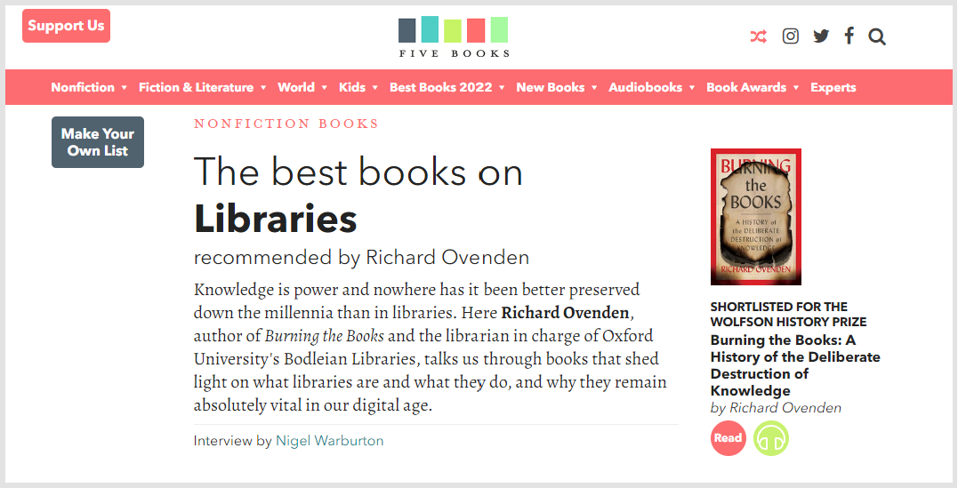
The first is the Five Books website, which makes, I think, very good font selections to unobtrusively contribute to a professional and welcoming site. It pairs the classic Avenir for headings with Alegreya for body text. Avenir is a geometric sans serif designed by Adrian Frutiger (of whom more below). It is softer than the well known geometric font Futura (which its name echoes) and is highly legible and balanced. It feels remarkably 'achieved.' Alegreya combines "exuberant and contemporary shapes and treatment with the DNA of classic book types." Alegreya also has a lovely italic.
There is a nice tension between the geometric Avenir and the calligraphic flow of Alegreya which gives the site some energy while being very legible and functional.
Note: Avenir needs to be licensed from Monotype, who have acquired the rights to many classic fonts; Alegreya is from Huerta Tipográfica, an Argentinian foundry, which has several high quality fonts freely available on Google Fonts.
The second is The Verge website, which recently went through a typography-led redesign. In terms of overall design, I imagine some may find the very distinctive logo and color choices a little distracting, although I like them. Some readers may also pause over the mix of sans and mono in the sidenotes. While it wants to make a statement, it also wants to provide a functional effective reading experience. I think the fonts support both of these goals very well.
The site uses PolySans, a neo-grotesque sans (Helvetica-style) for headings. This functions in low sizes for UI features and becomes more expressive in large sizes with subtle inktraps (notches). Inktraps have been a trend in recent years, and can appear gimmicky. I did not find them so here, and thought they enhanced the well balanced headings. There is a real italic (some sans serifs will just slant for italic) and a PolySans monospace font for accent text. Monospace fonts provide very nice accents: they can seem both tech forward (used in coding) and a bit retro (typewriter). I would not have italicised the captions here, but that is a small point. Together and across its variations, PolySans signals attention to design, a tech orientation, and a modern sensibility. They also use Manuka occasionally for headings, a strong compressed font for display in larger sizes.
PolySans is paired with FK Roman Standard for body text: "a neutral serif typeface, inspired by a newspaper typography giant Times New Roman." This is described by the foundry as 'utilitarian' and a 'workhorse.' It works very well for medium length reading, which The Verge encourages. I think The Verge combines function and feeling very well here.
Note: I like that The Verge is supporting the work of two relatively small independent designer foundries. PolySans is from Gradiant, based in Bergen. FK Roman Standard is from Florian Karsten Typefaces, based in Brno, Czech Republic. The third font, Manuka, is again from Klim Type Foundry.
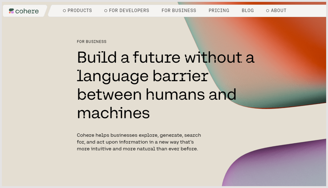
And finally, a custom font on the website of another AI company, Cohere, provides an example of a more explicit statement. The goal was to "create a visual identity that could bring language AI [...] out of the realm of bleeding edge, experimental tech, and into today’s business needs." I think the body text, influenced by a techy monospace vibe, is lovely. The headings have a futuristic 'dot' feature, which can be varied or turned on and off. It is designed by Nan and I think it contributes effectively to storytelling about the company and its identity. Would the website and the 'dotted' typeface feel a little overwrought if you have to interact with it regularly? I don't know. I do know that it created a very positive first impression with me. I admired the desire to use the typeface in this way, and I wanted to know more about the company.
Five Books, The Verge and Cohere: font choices
Five Books and The Verge also showcase an important typographic consideration: pairing fonts. There is a lot of attention given to finding fonts which complement each other, and there is quite a bit of 'pairing anxiety' about finding good matches. I think the pairing works very well in each of these cases. Cohere shows a different approach, where a single typeface family is used, albeit in this case one with quite a bit of expressive variation (including the 'holes' in the headline version).
What matters to us is this: What story does a typeface tell? What kind of personality does it have? // Grilli Type
Design matters
But in reality, picking fonts is only a small fraction of the battle. The vast majority of typography in day-to-day UI design is styling fonts you’ve already chosen. // The Step-by-Step Guide for Pairing Fonts, Eric D. Kennedy
Font choice is only a part of overall typography and design. And in fact, the same font can look very different in different settings, and may be styled in different ways. A wonderful font will not save poor design work, and routine fonts can look well as part of an overall good design.
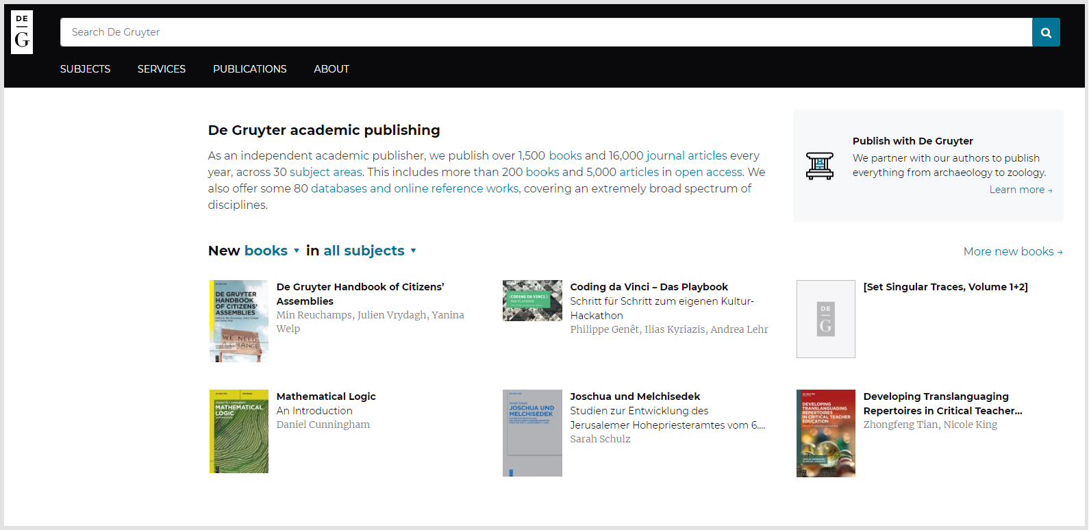
For example, look at these three sites using the same font, the remarkably popular Montserrat. I stumbled onto the De Gruyter website a while ago, and immediately liked how the home page was quietly and effectively laid out. It uses Montserrat for headings and text, in small sizes. Another very popular Google font, the serif Merriweather, contrasts nicely for a warmer welcome message). This combination is used to good effect throughout, with Merriweather providing text, and Montserrat used in various ways for headings and text. They vary weight, size and capitalization throughout. I like the way that book titles always stand out. More boldly, the Western Washington University website uses Montserrat in all caps and a heavy weight to communicate its message.
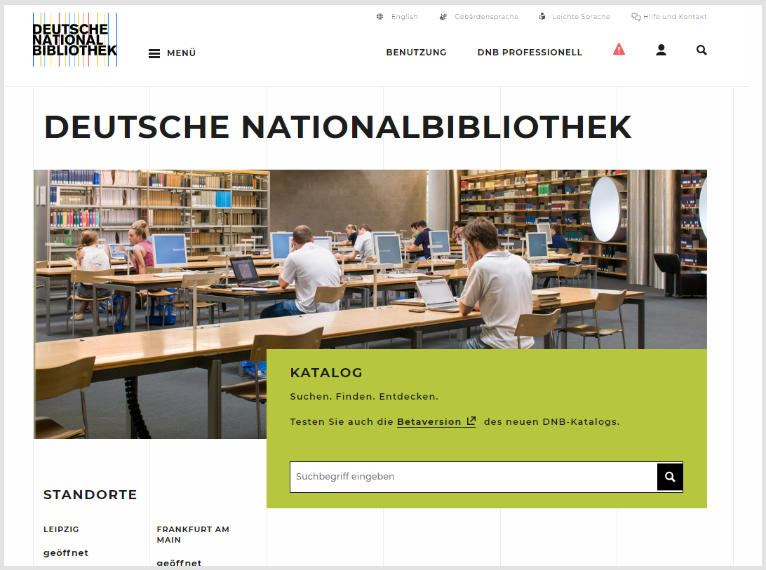
The Deutsche Nationalbibliothek website uses Montserrat very effectively also, as part of its overall design. It is the font used on the home page and for headings. There is nice use of all caps, tracking (the space between letters is stretched a little in headings), and hierarchy throughout. As noted later, it is also nicely paired with a serif font for body text. The DNB name on the home page is striking in a subtle way, for example, in all caps and slightly stretched, although it sits a little redundantly beside the strong logotype. I thought it was interesting how they make grid lines visible as part of the user interface, and I really like the use of color throughout. The use of Montserrat here is an integral part of what for me was a very good experience - at once warm and confident.

Styling Montserrat differently
There are two points I want to make here. First, while De Gruyter, the DNB and WWU are all using Montserrat for headings and other elements, they are quite different. Overall design make a big difference, underlining the significance of the Eric Kennedy quote at the beginning of this section. The cumulative effect of a site that focuses attention, makes good use of white space, has good visual hierarchy, is laid out on a grid, and so on, is what one responds to. Font choice is a contributor to, but probably not in most cases a determinant of, response.
The second is more complex. Would the designer font Gotham work more effectively than the free Google Font Montserrat here? I mentioned Gotham above and you can see it in the NYU panels. An afficionado might argue that Gotham is a higher quality font, which matters. However, most people might not notice if it were substituted?
The fonts ecosystem
I am a little surprised that libraries are not more alert to font choices. For design reasons, for sure. But fonts may also involve expenditure, and they involve choices about values. One would expect values-driven organizations like libraries to have more of a point of view about where they invest or how they choose to present themselves. Here are some of the factors that might influence a point of view.
Google in particular also exercises considerable cultural power: the free and convenient distribution of fonts has created considerable conformity of use around its popular fonts.
Business ecosystem
There is a diverse ecosystem around font design and distribution. You have three dominant distribution players who are very differently situated (Google, Adobe and Monotype); you can rent fonts or license them as works in progress; there are edgy independent font designers (e.g. Nan), small independent foundries with one or a few designers (e.g. Connary Fagen, Flavia Zimbardi), established boutique design houses (e.g. Klim, Dalton Maag), and multi-faceted foundries with large catalogs (e.g. Canada Type, Indian Type Foundry, Typotheque); there are distributors who work with independent foundries, as an alternative to the big distributors (e.g. I love Typography or Vllg or Type Network). Foundries provide retail fonts for licensing and also do significant custom work (see the very nice work commissioned by Syracuse University, with a lovely back story extending into special collections, for example, or the striking RISD font, apt, it seems to me, for a design school). There are associations, prizes, and venues for discussion and commentary. Aspects of this ecosystem are described further below.
Values
 Meg Farmer
Emphasises the increasing importance of values-driven work and choices
As in any community of reasonable scale, there are oppositional and alternative perspectives, complaints about commercial enclosure of classical work (e.g. by Monotype), disagreement about licensing and royalty terms, concern about hegemonic, western views (Helvetica is universal or neutral? Really?). There is a history of hidden labor by women (see the marvellous Ange Degheest project), lack of women in leadership positions, and low numbers of designers of color.
There is also great variability of font availability across cultural and language groups, which has an impact on cultural expressiveness and identity (see this intersection of the personal, professional and political in a discussion of the politics of Arabic type design by designer Nadine Chahine, now the CEO of I Love Typography). There are mission-directed sites such as the marvelous libre and open source collection at Velvetyne, home of typographic quirk and quiddity, and the Bye Bye Binary Type Library.
The Harvard Library has a useful and untypical (for a library) set of typographic guidelines which visibly and effectively carry through into their website. They use two very common Google fonts, Lora and, again, Montserrat (in a minor fork, Trueno). As of this writing, Google Fonts notes that Lora is used in over 2M websites, and Montserrat in over 16M. The Google Fonts API served up Montserrat an eye-brow raising 9.44 billion times in the week this was written. Harvard uses Fontlibrary and Fontsquirrel (part of the Dribble group), two sources of free fonts, to download the fonts, and these fonts are also available in other places. So the actual deployment numbers will be higher that those reported by Google.
The Harvard Library website notes that the fonts are open source and as such aligned with one of its guiding principles. However, are there other open source choices than two of the most common fonts in the world, part, some might argue of a Google monoculture? And I also wonder if a better values choice would be to put some design money into the creative ecosystem? In what I expect was a purposeful decision, The Mellon Foundation uses the highly acclaimed Halyard ('a bold visionary statement') on its website , "a robust sans designed by the first Black American type designer Joshua Darden (with Eben Sorkin and Lucas Sharp)" [Pentagram]. I noticed a while ago that The National Museum of African American History & Culture uses another super-family, Freight, designed by Darden.
Typography site Alphabettes.org : "Our loose network is here to support and promote the work of all women and nonbinary people in our fields." This is an article by Namrata Goyal, the creator of Biblio, one of the very few typefaces created for or by a library.
Fonts for free and fee
Avoiding (for now) the enormous topic of free fonts and their effect on the type design scene, license-free typefaces play their role in servicing big and small studios. The result, however, is bland, overly familiar and encourages a world of identical brand identities and graphic design projects. // Alternatives to Google Fonts — Part 1, Pangram Pangram
There are four principal models for acquiring fonts. As noted above, there is great variety within this ecosystem:
- Free fonts: There are many sources of free fonts, notably of course Google Fonts. Fontshare from Indian Type Foundry is another convenient source, including their own fonts and a curated selection of others. There are many other free fonts from other sources. I mention some below.
- Subscription-based services: In this model a subscription allows you to access a library of fonts for use for as long as the subscription lasts. Adobe Fonts is a major subscription service, with a large library of commercial fonts. Monotype also offers this option, as does Typesquare, a service of major Japanese foundry, Morisawa, and others.
- Purchasing licenses: Licences to use fonts can be purchased from individual foundries, from indie aggregators such I Love Typography and some others mentioned above, from aggregators of creative assets such as Envato Elements, or from font aggregators such as Monotype, Fontspring (now part of Dribble), and others. Typically, you can buy typefaces by a font family or by single instances (e.g. Regular, Regular Italic, Bold, Bold Italic, ...). Prices vary considerably from a few dollars from some of the creative asset aggregators to much higher for designer or classic fonts.
- Custom fonts: You may commission custom fonts from a foundry or designer.
It is worth noting the not uncommon sentiment from (commercial) designer foundry Pangram Pangram above. Some will argue that paid-for fonts will deliver higher quality and distinctiveness. And that free fonts lead to bland uniformity. Discussion of free tends to be bound up with the influence of Google in this way, given the number of fonts it makes available, the convenience of using them, and, very importantly, its great distribution power. I was interested to discover that Google Fonts predominate font usage in national libraries, and I return to the question of font monoculture below.
There is also concern that money may not be flowing into the system, supporting designers. Foundries balance retail work with custom work, and interest in branding and identity is strong. I have not seen any economic analyses of the sector, but new foundries, designers and fonts emerge regularly.
There are many fine free fonts. And given the vast range of paid for fonts it is inevitable that some are less good than others. Needs also vary: sometimes designer distinction may be wanted, sometimes something reliable which blends in.
While Google creates or subsidizes the creation of free fonts, there are many other sources. Of course, many of these will become available on Google Fonts (and elsewhere). Here are some examples:
- Tech companies are a major source of open and free fonts. They may develop them for their own purpose and then release them for general use. For example, IBM Plex is a comprehensive and much admired super-family of fonts (sans, serif, mono) which has a fascinating microsite describing design choices in the context of IBM history and brand, and locating choices in an overall typographic design space. DM (sans, serif, mono) is a font family created by British designer foundry Colophon for Google's DeepMind, and you will see DM Serif used in the national libraries of Finland and Spain. DM Serif is based on Source Serif Pro, Adobe's first open source font, which is widely used (it is often paired with Klim's Sohne in Medium posts). Its companion is Source Sans Pro and there is a nice monospace also. (Source Sans Pro is used on the websites of the National Library of Mexico and Biblioteca Nazionale Centrale di Firenze. The National Library of Israel uses Assistant which is a Hebrew match of Source Sans Pro.) Fira Sans and Zilla Slab were commissioned by Mozilla (they are currently used on the NISO website). More recently, GitHub released the very nice Mona Sans and Hubot Sans. These fonts tend to be of good quality and are widely used; some of them feature high in Google's usage statistics. There are many more.
- Another source is public or national bodies. I discuss some national examples below (e.g. the very popular PT Sans and Serif, and Public Sans). Plus Jakarta Sans is a non-national example with interesting variations, and there is a Dubai font (developed by Nadine Chahine, who talks interestingly about rationale, tone, the relationship between Arabic and Latin, and the political protests about the font).
- And then, many organizations who commission fonts may make them more widely available. This is the case with Brill, the publishers, Cooper Hewitt, the BBC, the French national research organization, INRIA, Radio Canada, the brand agency, Instrument, and many, many others.
Note: Brill is especially interesting from a library point of view. It commissioned the typeface from Tiro Typeworks, who specialise in multiscript work. A design goal is to successfully accommodate the full range of challenges that might be encountered by a scholarly publisher in the humanities, across current and historic languages, philosophical logic, and so on. And to do so in a way that allows a consistent 'Brill' look and feel.
And finally, the font comparison may not always be carried out on a level playing field. Not unnaturally, a website that goes for a designer or distinctive font will probably also invest in design, which enhances the overall contribution of the font and displays it to advantage. Free fonts may end up quite often on sites with less distinctive design attention.
A note on three distribution platforms
While there are various distributors, three mentioned above are very important: Google, Adobe and Monotype. Each has a different business model and position. These companies have scaled their platforms to the network level where they effectively aggregate supply (fonts, foundries, designers) and demand (designers, publishers, website managers, and so on). We see the platform concentration familiar from the dynamics of the web in general. While their market power may be resisted by some foundries, they channel a large part of font distribution.
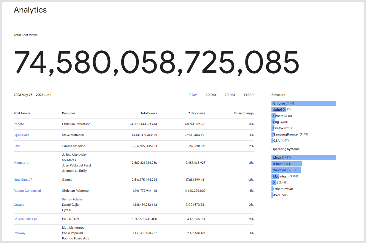
Google in particular also exercises considerable cultural power: the free and convenient distribution of fonts has created considerable conformity of use around its popular fonts. Font identification app Fonts Ninja claims that 65% of websites use one of the following four fonts: Roboto, Montserrat, Open Sans, and Lato, the four most popular fonts on Google. (Perhaps we could call them collectively ROMoLa - Roboto, Open Sans, MOntserrat, LAto.)
As noted Google Fonts plays a central role in the provision of free and open source fonts, as part of their general work in making the web work more effectively. They developed Roboto for their own use, as part of Android. Noto Sans is a part of an ambitious project by Google and partners to develop aesthetically aligned and consistently rendering fonts for all scripts represented in Unicode, and there is now an extensive family of Noto fonts covering many languages and scripts. And they subsidize the creation of many other fonts where they see gaps.
However, there is nothing wrong about Open Sans specifically, my point is that it’s just overused, it’s the new Arial. And I guess most people might use it just because it’s popular. When something has so many views it can’t be bad, right? Wrong! Choosing a typeface is an opportunity for your website, app or digital product to show personality, be memorable and stand out among its competition. And if you’re just using Open Sans you’re missing out on that. // Stop using Open Sans – Why your font choice matters, Oliver Schöndorfer
Adobe occupies a different space in virtue of the centrality of Creative Cloud applications in the creative, web design, publishing and related industries. Users of those applications have subscription access to the wide collection of commercial and other fonts in Adobe Fonts. Adobe also creates its own fonts (Adobe Originals), and is responsible for the widely used open source Source family of fonts (sans, serif, code).
Monotype is different again in that its focus is on font creation and distribution: it is a typeface company. It is a major foundry which at once does custom typographic work, designs retail fonts, and aggregates fonts from others for distribution. It has actively consolidated other foundries and distributors over the years, including Linotype, Fontshop, Berthold, ITC, Bitstream and so on. Recently it acquired leading independent foundry Hoefler&Co which publishes Gotham among others. In this way, Monotype has acquired the IP of many classic typefaces which are not available in other ways. They maintain several storefronts including myfonts.com, fontshop, and fonts.com.
A note on discovery
Such is the range of fonts and distribution channels there is a general discovery issue. And this is why there is a huge volume of guidance and commentary about choice of fonts. There are endless lists of free fonts, or general fonts, often in the form of thinly disguised product marketing.
This favors the large platforms, especially Google and Adobe (for those with a subscription) as non-initiate users are unlikely to look beyond them. Google is open and readily available. And Adobe is similarly available directly in the workflow to many in the creative, publishing, web design and related industries in virtue of the widespread use (and subscription to) Adobe products. It also makes it difficult for independent foundries to avoid placing their fonts with the large platforms. Unless they have achieved considerable success and associated gravitational attraction it is difficult for small or independent foundries to attract purchasers independently.
Some national library examples (CENL)
I have mentioned individual national library choices at various places throughout this piece. I have not systematically looked at all national libraries, but I have looked at a lot! In general, the popular Google Fonts (Roboto, Montserrat, etc.) seem to be used by a majority.
In a modest effort to reduce some of the randomness in my exploration, I did look through all the libraries on the CENL (Conference of European National Libraries) membership list. Rather than enumerating the various uses of Google Fonts, I thought I would mention the ones that used different or distinctive fonts. I am not saying that these are necessarily the best (however one defines that), and I have referenced other CENL libraries in other places.
As discussed above, Kris Sowersby wondered if fonts could have a regional or national accent: "The British have Gill Sans, the French, Garamond, the Italians, Bodoni, the Swiss, Helvetica." What about the national libraries in the countries that Sowersby mentions? Is there a national dimension in their font choices, do they have a regional accent? The answer to the question seems to be: mostly not. I cover all the countries in Sowersby's list below, including Germany and Italy even though they are indeed using Google fonts.
The British Library
The British Library has an extensive website. It uses Arial throughout. See Sowersby's description of Arial above: 'It's boring but it works.'
Gill Sans is certainly seen as characteristically British. However, given biographical revelations about Gill, it may not be thought to be an appropriate choice for a national institution. Maybe Johnston might be apt, the font used on the London Underground. Edward Johnston was a mentor of Gill's and several modern interpretations of the font exist (including Hoxton North by the foundry Northern Block, located in the North of England). Elsewhere there is a rich legacy in Caslon, Baskerville or, in what would be a nice move, the work of Margaret Calvert (who jointly designed fonts used in British road, rail and underground). And of course, more than one can be used. However, as I note in conclusion below, identity is not singular.
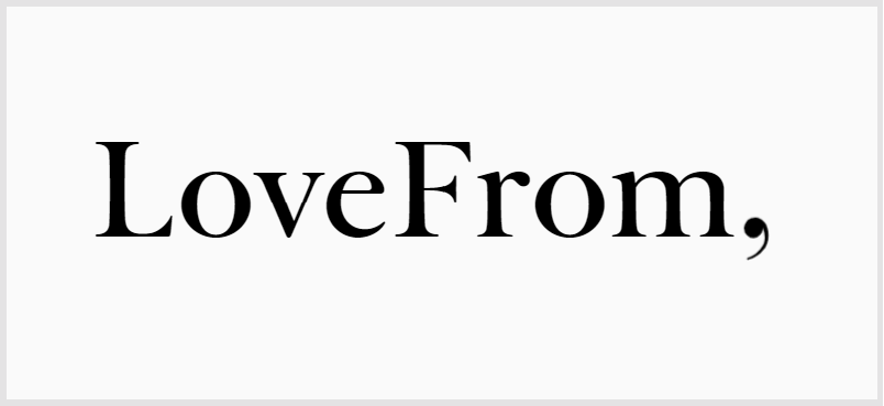
I recently read about the typeface created for Jony Ives' company, LoveFrom. It is based on Baskerville and is used in some quite lovely work which the article references. Perhaps The British Library could commission the person who did so much to shape design in the 21st Century (while creating Apple's hugely impactful products), and whose company font is based on Baskerville, to develop a font for the British Library?
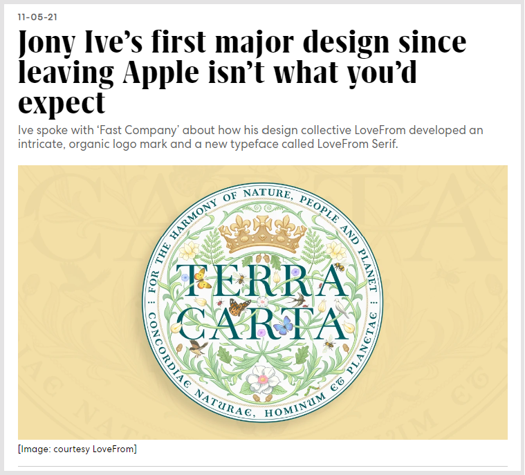
Note: The designers researched background for LoveFrom Serif in Cambridge University Library, and some pictures of Baskerville's metal punches are reproduced in the article. Reading the background stories on fonts it is interesting how much time designers spend in libraries and archives researching antecedents and influences.
Reading the background stories on fonts it is interesting how much time designers spend in libraries and archives researching antecedents and influences.
The National Library of the Czech Republic
The National Library of the Czech Republic uses a mix of Arial and Tusar Deco. Upon investigation, I was very interested to discover that Tusar Deco was a variation of Tusar, a typeface by the well known Storm Type Foundry, which was in turn was a recreation of Tusarova antikva. The latter was the only typeface created in the 1920s by Slavoboj Tusar, the brother of a former Czech prime minister. Storm have several historical recreations, connecting to earlier periods in Czech history. František Štorm has a very interesting historical and personal statement on the website (dated 2015). He talks about digitizing the "masterpieces of our national typographic tradition" dating from before the iron curtain. He also talks about the "emotional impact" of a typeface, alongside its functionality, and its ability to contribute to a unique identity.
Typefaces have their souls much like drawings, paintings or music. Latin alphabet is nothing but a composition of fine-tuned elements, orchestrated with passion. The strongest imperative in today's design is originality, and as there are thousands of indistinguishable fonts out there, we should ask for unique typefaces. // Storm Type Foundry
Of course, not everybody who looks at the National Library will grasp this background, but the font is distinctive, and connects in an interesting way with a broader history. I know little about the history or about how Tusar the designer was perceived. However, I had thought I might see more examples like this, where there was some local cultural connection. It would be nice to swap in a better substitute for Arial to complement Tusar!
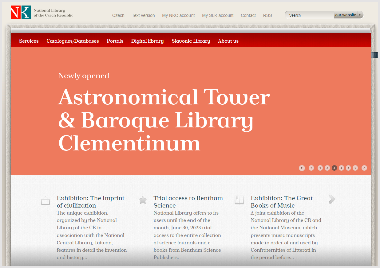
Tusar Deco
Royal Danish Library
I was curious what motivated the choices on the The Royal Library website. They use two typefaces with some personality which support the library well without being intrusive or overly familiar. The dominant font on the home page and used throughout for headings is Noway, a tidy sans serif distributed by Atipo, a Spanish foundry with a novel 'pay what you want' model. It originated in a commission to design a font for Luton Airport (both signage and identity), so shares something with Frutiger. In fact, in discussing the design they compare it with both Frutiger and DIN, and characterise it in this way: "the font has a technical air but with a humanist beat which, together with rounded ends, make it friendly; with personality without being strident." I think this is a reasonable description and I was struck with the very clean design when I first opened the site. They have altered the tracking to tighten it up a little.
It is paired with Noticia Text which is used for body text. This is a slab serif which is available on Google Fonts, and which is designed for running text.
Deutsche Nationalbibliothek (DNB)
Sowersby does not mention Germany in the list above. If he had he might have suggested DIN as the national typeface, now widely used in many interpretations, or something in a Blackletter style.
I have already discussed the DNB above, as a good example of how Google fonts can work well with good typographical layout. I described there some things that I liked about the site. Montserrat is the font used on the home page and for headings. Crimson Text is used for body text throughout the site (it is also on Google Fonts). This is a so-called 'old style' font, a serif font influenced by classic Garamond typefaces and developed for book production. I think it works well, and pairs well for the headings. And as noted above, I like the use of color throughout.
The National Library of Estonia
I was excited to see that the library has actually got its own font, RaRa Sans, one of the very few commissioned – or intended for use – by a library. It is a geometric sans by Estonian designer, Anton Koovit, based on his retail font, UCity Pro (see the background here). The site also uses the very popular font Inter for body text (whose designer, Rasmus Andersson, is from nearby Sweden), available on Google Fonts and elsewhere. There is also a third sans serif font in use: PT Root UI. This is from well-known Russian foundry ParaType.
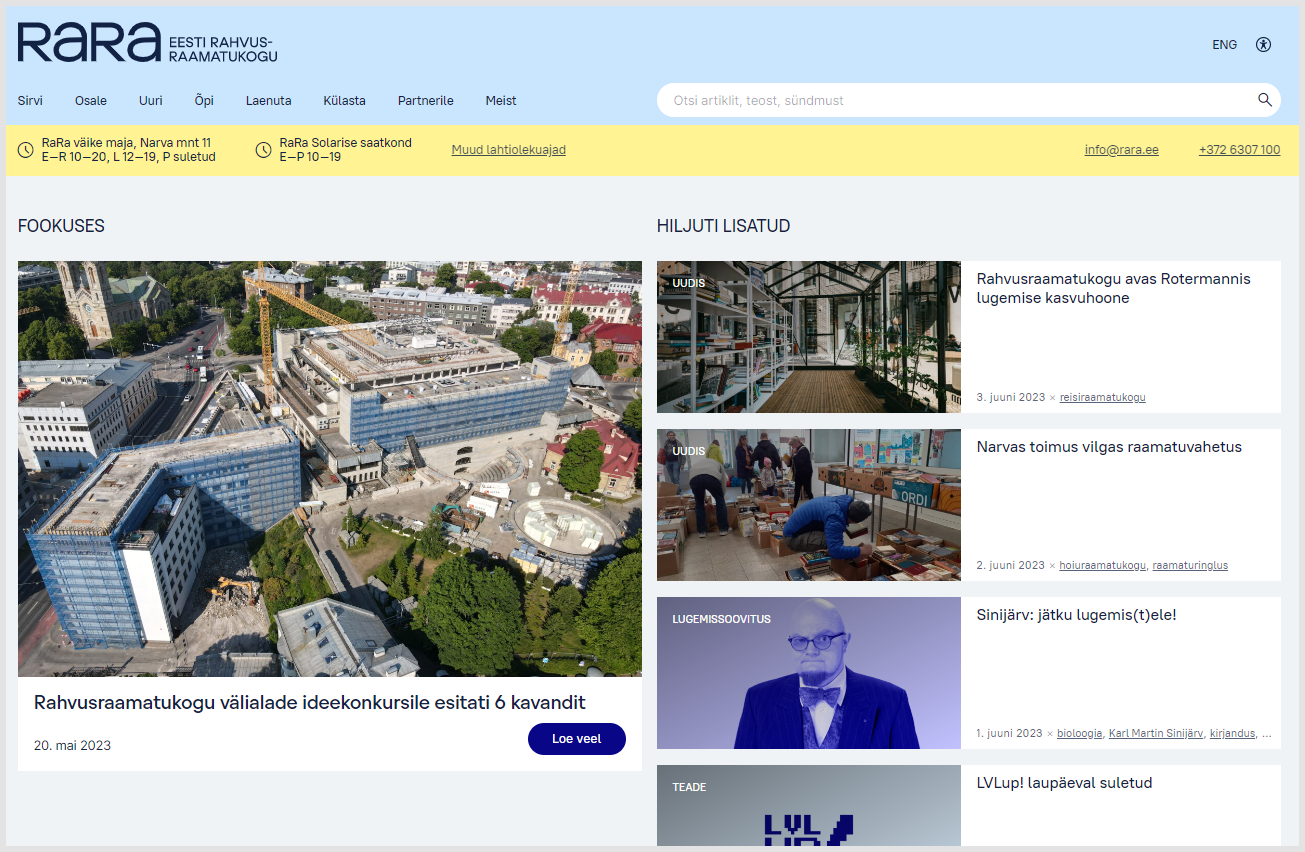
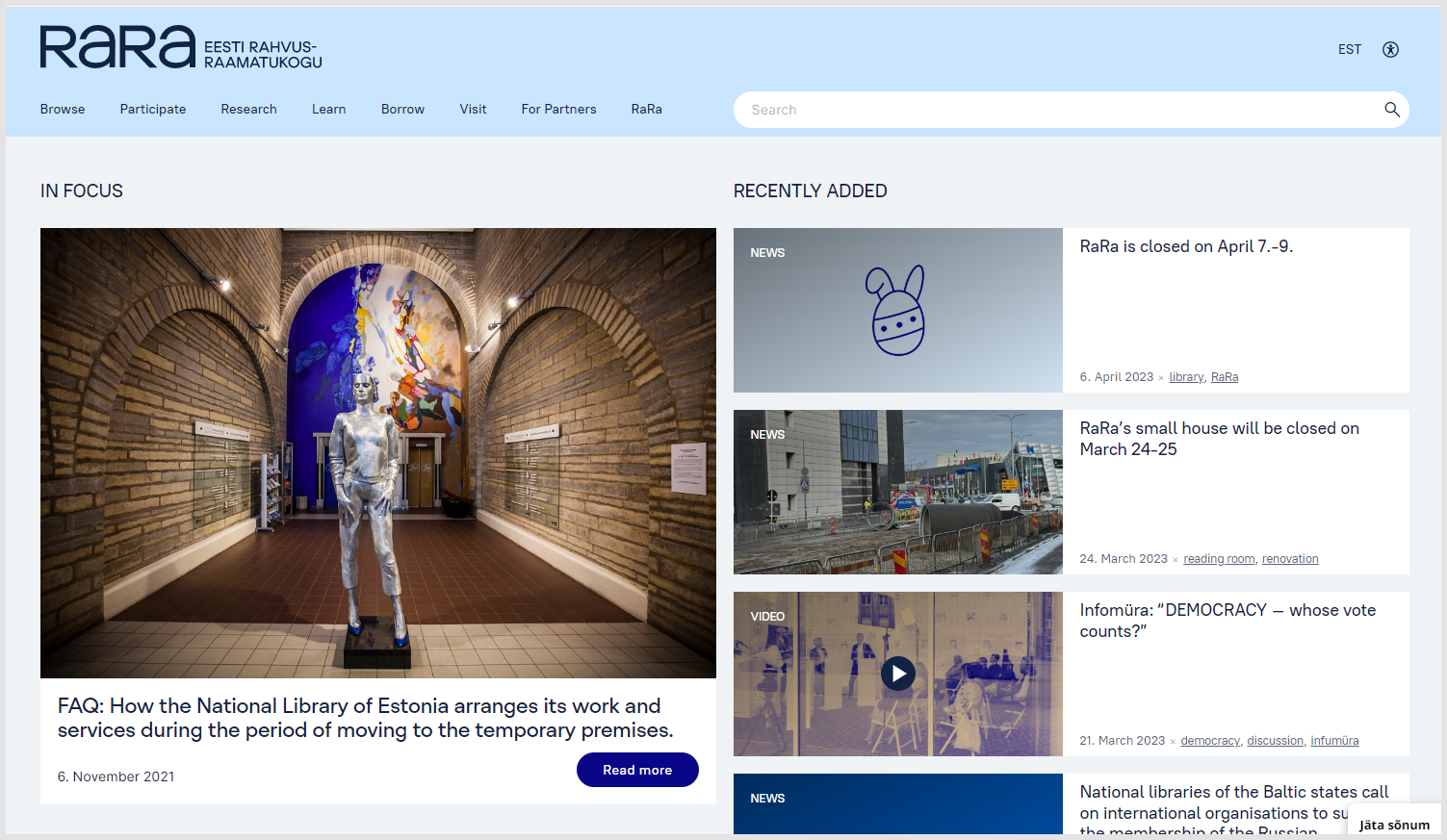
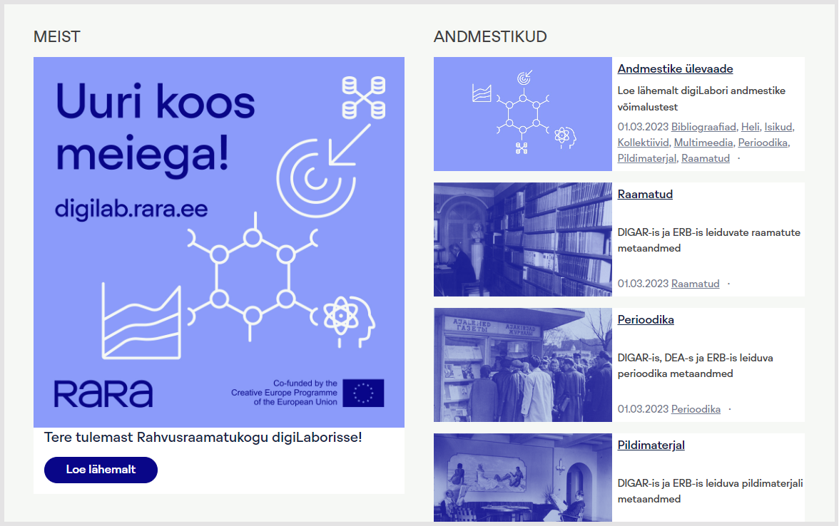
RaRa Sans (heading under feature picture) and PT Root UI mixed in first two panels. RaRa Sans in third.
I wondered why they mixed three sans serif fonts in this way. I was pleased to come across another library custom font, and would be interested to know more about the rationale and intended use. RaRa Sans seems to be used throughout in the Digilab area (third panel) and, I thought, looks well. I thought the body text looked small, but then I often do.
Incidentally, I discovered that the library is in the process of moving to a new building, which will be more open, social and welcoming.
Spending time in the library should be more exciting and natural than hanging out in a shopping centre. A warm, bright and interesting place in the cold season, pleasantly cool and ever interesting in the warm summer. // RaRa
Bibliothèque nationale de France
The BNF was a little surprising to me. The heading or display font on the home page is Gabriela Stencil, an elegant, high contrast font used in all caps. It is a font in the so-called Didone style, reminiscent of the 19th Century (as is Bodoni, Sowersby's Italian mention). It is quite distinctive and the atmosphere it creates is one of ... luxury and style? The stencil feature amplifies this feeling. However, the text font used is Roboto, the Google font created for Android, and, as noted, one of the most widely used fonts in the world (the condensed version is used). This seems strange given the historic position of the BNF in relation to the advances of Google, but also in the context of French particularism and national identity. Perhaps it is just an acknowledgement of the increasingly default nature of Google fonts on the web? As noted, Roboto is very widely used in national libraries. That said, while the text is small, it is used with good spacing and hierarchy.
The National Library of Ireland
The National Library of Ireland unveiled a welcome web redesign recently. They actually use two fonts from Klim. The headings are Feijoa Display, the earliest Klim font, and the body text is, yes, you guessed it .... National!
From the Klim description of Feijoa: "It’s based on the principle that ‘a straight line is a dead line’, which explains the warm, curvaceous nature of the individual letterforms." I think this works well with National throughout the website and indeed this is the pairing recommended on Typewolf.
It is also somewhat on trend. See the use of Clearface in the National Library of Norway. I mentioned the Mellon Foundation and Ithaka - each uses a flowing serif font for headings. And more generally, one can see the influence of arts and crafts, art deco and art nouveau appear more frequently?
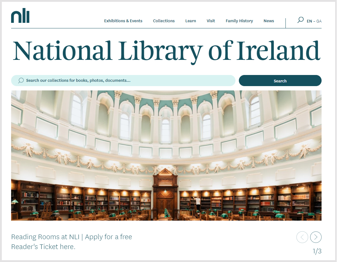
They have an issue which is common for universities, who often have crests or logos with more 'classic' fonts than they choose for the website. There is a something of a clash between the website fonts and the logotype here, which is really in a rather different style. Perhaps the rounded 'n' is meant to echo the dome of the building (a feature of the rather fine logo that this replaced several years ago)?
Italy
Italy has two central national libraries, one each in Florence and Rome. The Biblioteca Nazionale Centrale di Firenze uses a popular Google Font, Playfair Display, for headings, paired with Adobe-created and open sourced Source Sans Pro for text. Source Sans Pro also features highly on the list of most popular Google Fonts above. This is another site using mainstream free fonts to good effect. There is no specifically Italian emphasis as far as I can see. At the time of writing, I could not connect to the national central library in Rome.
The National Library of Luxemburg
OK, so this is a highlight for me. After all that Roboto and Open Sans my heart leapt to see this:
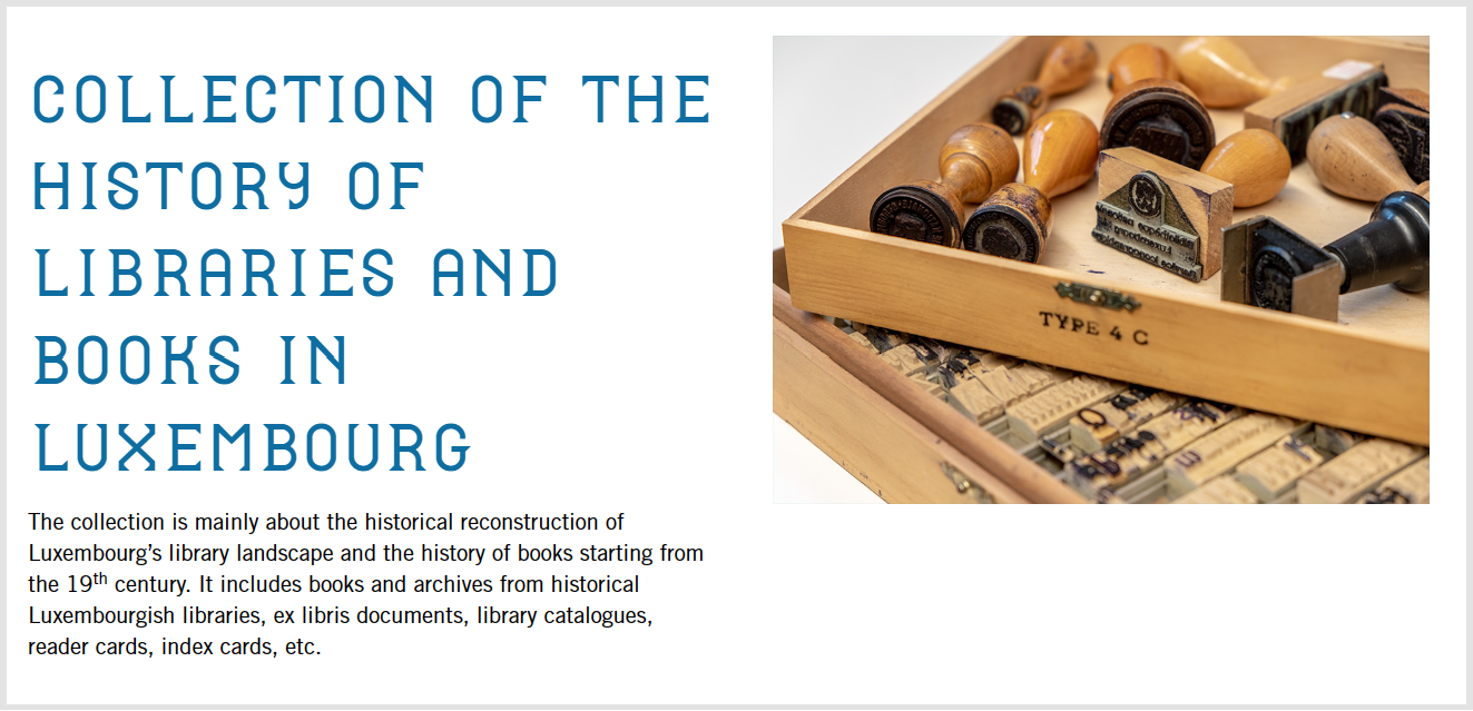
Lettering on entrance, signage, web font
Simply great. The library worked with Pentagram to develop identity, signage and font. The headline font is quirky and readable, unique and memorable. It is also used in signage and is designed in a modular way as the signs are put together from alphabetical/numeric cubes. I really like that the typeface on the website and the physical signage are continuous with each other in this way, underlining the singular identity and service. Then, they don't just opt to pair it with Roboto or Montserrat. They use a classic sans serif, Trade Gothic, with nice typographic variation (compressed in navigation header, occasionally all caps, white space). Trade Gothic dates in its original version from 1948, and so preceded Helvetica and Univers and their influence.
Pentagram has a description of the design project, including some lovely pictures (I hope it is OK that I copied two of the pictures above).
I really like that the typeface on the website and the physical signage are continuous with each other in this way, underlining the singular identity and service.
The National Library of Norway
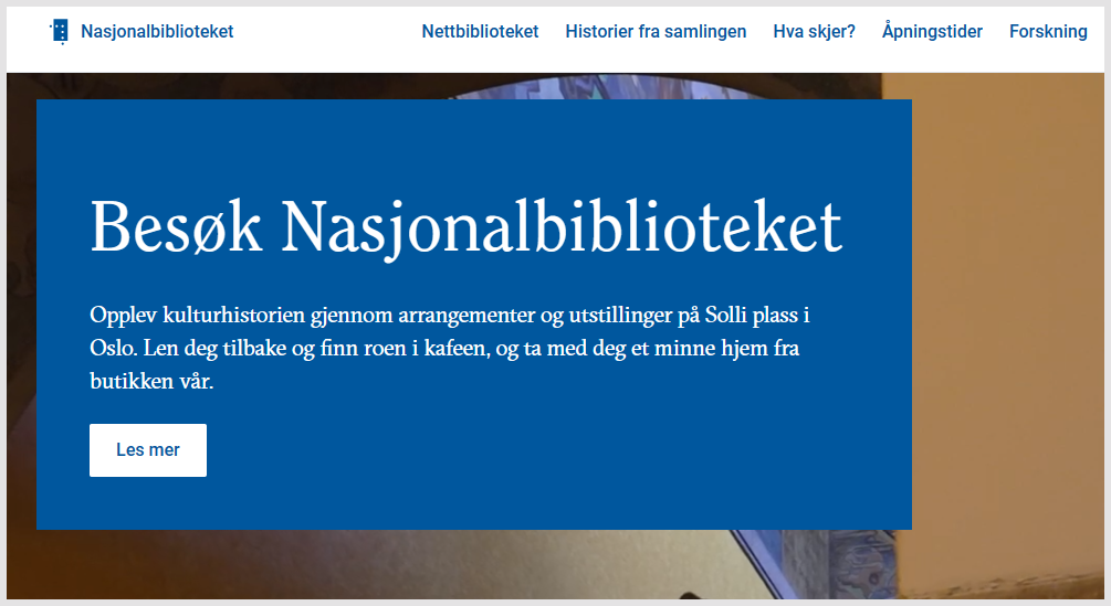
The picture above shows three typefaces: Roboto (in the header navigation bar on top and in the button, and used throughout) and then two serif fonts, Clearface (the headline, and used for headings) and GT Sectra (the text paragraph, and used throughout for text and some headings). Clearface is a font originally designed in the early 20th Century by prolific American designer Morris Fuller Benton. Wikipedia notes the influence of the arts and crafts movement, drawing attention to its "warm curving design." Incidentally, Kris Sowersby writes admiringly about Clearface as he introduces a modern reworking of it.
GT Sectra is a designer font from Swiss foundry Grilli Type. I like its jagged calligraphic appearance. I think it provides really nice readable text here. One of the nice things about foundry fonts is that they are often accompanied by detailed accounts of origin, influence, design considerations, and so on. Here is Grilli Type discussing the development of GT Sectra.
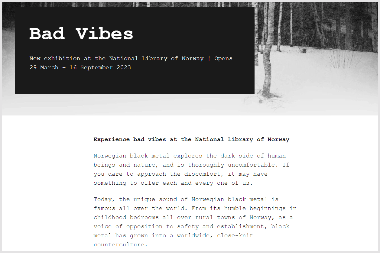
I am also increasingly drawn to expressive and readable serif fonts, in both headings and especially in body text. My sense is that this may become more common, as welcome relief from the predominance of sans serif on the web? They go with storytelling. Speaking of which, I liked the Stories from the collections section of the site which includes a section on Norwegian black metal.
I also really liked how they used a monospace font (Courier) in the special feature on the Norwegian black metal exhibition.
So, a lot to like here. What is slightly puzzling to me is why they use two serif fonts, each individually nice, but which may clash a little, and especially given those serif choices, why they didn't go for a more distinctive sans serif than Roboto (acknowledging that it is perfectly functional here).
The National Library of Poland
The National Library of Poland also uses Klim fonts. It uses a wide version of Söhne in all caps for feature text (see the boxed text in the screenshot). It uses Tiempos Headline for headings, a serif font designed for editorial purposes which looks well here. And then it uses Roboto for text. Again, it is interesting to note the popularity of Roboto for text, and to wonder if they considered using either of the two other fonts for this.
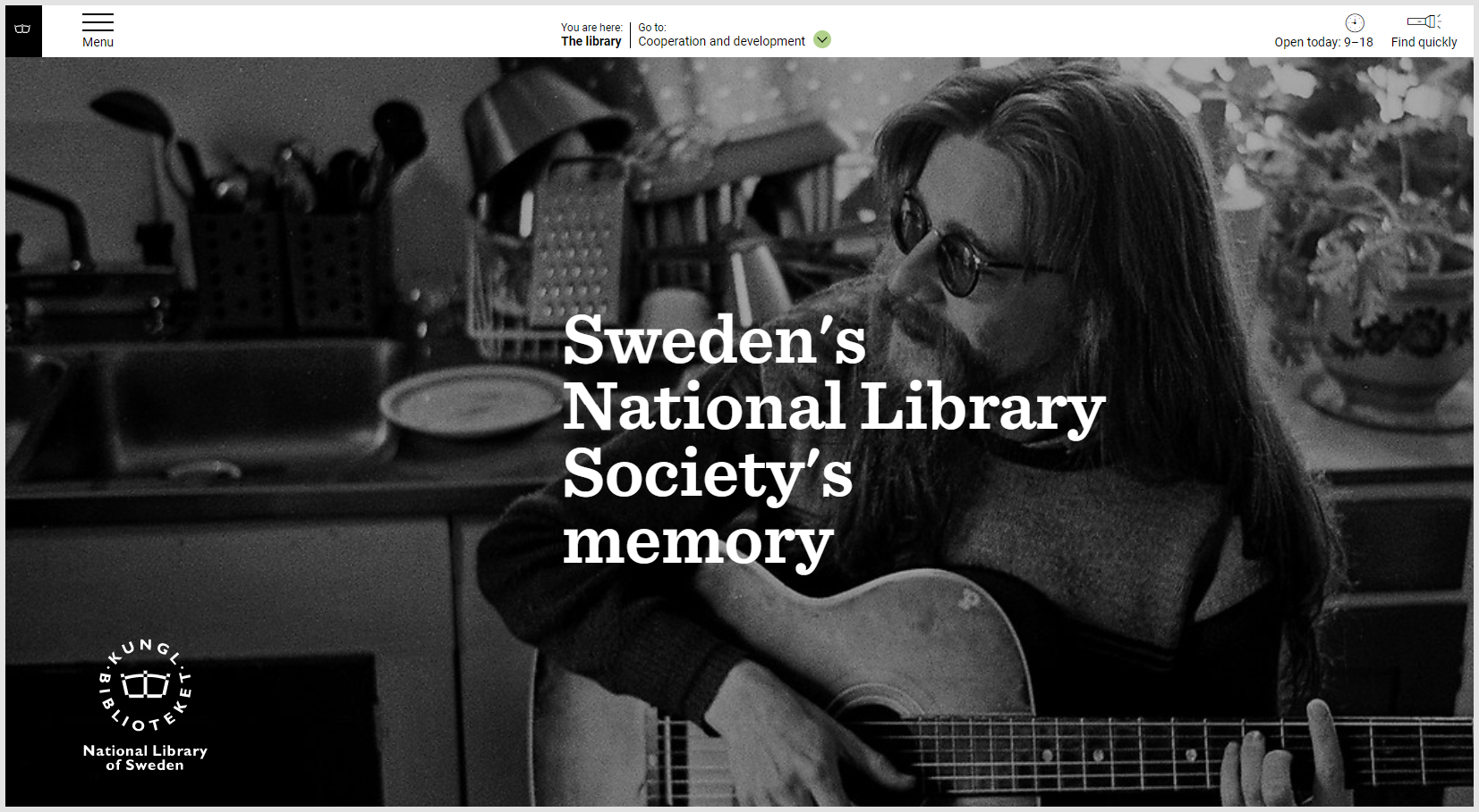
The National Library of Sweden: interesting in multiple ways
I really liked this site and think it is more generally interesting and indicative of a broad trend. The library leads with a slab serif, Sentinel, from prestige foundry Hoefler&Co (now owned by Monotype). It is paired with Google's Roboto.
I have recently been arguing that library websites should move from a focus on interactivity to a focus on storytelling, as part of an overall relational turn. I think that this website moves in that direction. I like that it separates clearly its services to the public from its services to other libraries. It leads with a large picture on the home page and uses pictures regularly throughout. There is a consistent grid structure.
And the font actually works very well. It reminds me very much of a newspaper font (the Guardian, for example, uses a slab serif). Its lines are of contrasting thickness. In fact, its weight seems to lend some weight to the story it is telling. It works in headings (which look like newspaper headlines) and in text.
It is strong enough to help knit the website into a coherent layer which opens out to other resources when necessary. Sometimes, in contrast, library websites can seem to be a thin signposting layer which sits on top of other resources.
And although the Sentinel font may not have particular Swedish resonance (that I know of), the site itself communicates strongly about what it has to offer and its contribution. The font alone is not creating the whole effect, but it supports it, with an even, unifying, and consistently strong presence.
Incidentally, I also like the logotype here. It is distinctive but unobtrusive, it is visible but does not set up a separate focal point.
I have recently been arguing that library websites should move from a focus on interactivity to a focus on storytelling, as part of an overall relational turn.
Bibliothèque nationale suisse
OK, so maybe the Swiss National Library is using Helvetica? Well, not quite. It is using Frutiger Neue. Swiss type designer, Adrian Frutiger, is seen by many as the preeminent (Western) type designer of the 20th Century (maybe alongside Matthew Carter, designer of Microsoft fonts Georgia and Verdana, among many others, and also the wonderful MIT logo and the custom Yale font). Frutiger is responsible for many typefaces, but is probably most well known for three which span the main sans serif categories. The pioneering Univers is a so-called neo-grotesque, similar to and a near contemporary of, Helvetica. Avenir is a geometric sans, and I discussed its use on the Five Books site above. Frutiger is a humanist font based on work originally done for signage at Charles de Gaulle Airport. It is widely admired, and Wikipedia references this remark by type designer, entrepreneur and font guru Erik Spiekermann: "the best general typeface ever."
So this seems a very apt choice for this particular library, in a country with a special place in (Western) typeface history. Of the national libraries mentioned so far, this is the one whose font choice has most lined up to some aspect of national identity.
National fonts, guidelines and cultural expressiveness
Government developed fonts
There does not seem to be a general pattern here, and while there are some national fonts they seem to have different motivations. By 'national' here, I am meaning fonts developed, commissioned or authorised by a government. This is different from Sowersby's sense of 'national' in my opening discussion where he wondered if some fonts had a national or regional 'accent', Gill Sans and British, for example.
I wondered whether some proportion of national libraries might use a national font of some sort. Of the libraries I looked at (and I did not look at every national library), the only one I found was Thailand. I was surprised to see that the National Library of Russia used Open Sans, given the PT fonts mentioned below.
I became aware of the Moldovan national font, Onest, recently. I do not know enough to comment on the motivation or the scale of its aspiration:
This is the first Moldovan made typeface created with a mere goal — to make communication between the state and the citizen honest and understandable.
Also, to bring Moldova's image closer to that of a modern, open country. // Onest
Onest is openly available for others to use. It is not currently used in the Moldovan National Library which uses Microsoft font Calibri.
DIN is an interesting case here. It is seen as quasi-official or national as it was initiated and managed by the national German standards organization (DIN) and was widely deployed in Germany. Developed for industrial and signage purposes, it was simple, engineered and legible. Following some more modern interpretations, it has become very popular and there are now many derivatives and reinterpretations. While it has a slight tech vibe, it is also used much more widely. It is the font of choice of ETH Zurich for example, and a version is used in the National Library of Iceland website.
Public Sans is a font developed for the United States Web Design System. It is actually used by the National Library of Finland where it is paired quite effectively with the strong DM Serif for headings. However, Public Sans is not used by the Library of Congress which uses Roboto Slab for headings, pairing it with the very commonly used Google Font Open Sans for text.
There is also actually a national Finnish font, developed to promote Finnish exports. It is called Finlandica and is available on Google Fonts: "Like the Finnhorse it's a breed suitable both as riding horse and workhorse."
There is a collection of Thai national fonts, developed by the government to reduce reliance on overseas commercial sources. Updated versions are available on Google fonts. One does appear to be in use at the National Library of Thailand.
Maybe most interestingly here, I note the very popular Public Type (PT) superfamily developed under the Public Types of the Russian Federation initiative: PT Sans and PT Serif. These are created by Russian foundry ParaType with "the financial support of the Federal Agency for Press and Mass Media." Interestingly, PT Mono was added with support from Google Fonts. The principal developer is Alexandra Korolkova (see this interview from 2014 describing the development of the PT family and other work).
PT Sans is used on the website of the National Library of Lichtenstein. PT Serif is used to good effect on the website of the National Library of Lithuania where it is paired with the rounded geometric sans, Quicksand. All available through Google Fonts and elsewhere.
National guidelines
Many university library readers will be very aware that their website needs to follow university style guidelines. There may in fact be no discretion at the library level. I wondered whether there might be a similar situation with national libraries and the government authorities within which they sat. However, this wasn't immediately obvious and would take some time to investigate.
It is the case with Library and Archives Canada, for example. LAC uses the very popular Google Font Lato for headings, and Noto Sans for text. I was a little surprised when I first saw this, thinking they might have gone with more distinctive – or perhaps Canadian – options. However, it actually inherits those decisions from the federal government, of which it is a part. Then of course, one might ask a similar question about choices at the federal level. The federal mandate includes Noto Sans for text. I did wonder if this was because of Noto's support of indigenous languages, but no mention is made of that aspect in the mandate (see BC Sans in the next section).
Cultural diversity and expressiveness
Ultimately, typefaces are a kind of "critical infrastructure" for each culture, a medium to store and transmit emotional tone. // Susanna Zaraysky, Google
Fonts make language visible, and allow it to be shared across space and time. To achieve that, there is quite a bit of work which we may now take for granted in, say, an English, French or German linguistic context, involving orthographies, scripts, Unicode, Opentype, fonts and a variety of professional skills.
I was very struck by this passage, noting how making typographic choices based on aesthetic considerations depends on an evolved language infrastructure that is variably available across language groups.
Many of these majority languages, such as English, are well supported by hundreds or thousands of typefaces. In addition, Unicode compliance and interoperability are increasingly taken for granted by users. Speakers of minority languages served by minority scripts and orthographies are not afforded the same ease of use. This typographical abundance leaves users free to focus their attention on typeface aesthetics, with choices motivated more by visual appeal and less by whether the typeface actually supports the characters and diacritics of a given orthography. Aesthetic considerations remain a luxury that most speakers of the Indigenous languages spoken in North America regrettably still cannot afford, as many of these languages struggle to identify a handful of typefaces that accommodate the core needs of their orthographies. For speakers of such languages, visual ‘look and feel’ unfortunately often remains a secondary consideration, outweighed by the central importance of correct formatting and Unicode compliance. // Julia Schillo, Mark Turin. Applications and innovations in typeface design for North American Indigenous languages. Book 2.0, 2020, 10 (1), pp.71-98. [pdf]
There are important cultural and political issues associated with fonts, and their availability is bound up with cultural diversity and expressiveness. Issues include:
- In a digital environment, we depend on language infrastructure to communicate: Unicode implementation, fonts, keyboards, software. If those are limited or absent, it restricts use and may further endanger a minority language, or cut it off from more general use, written transmission, and so on.
- If font choices are limited, it limits cultural diversity and expressive potential (Nadine Chahine discusses this in relation to the recent historical evolution of Arabic typefaces in this video The politics of Arabic type design, which, as I noted above, is an intersection of the political, personal and professional. From the description: "Typefaces embody the unspoken messages in our words, which is why it’s more important than ever that there is plurality for the voices of the Arabic culture.")
- Multiscript typefaces support consistent treatment across different languages. The Public Type (PT) family was developed in Russia to meet the objective that "the nationwide font must be multilingual" to provide consistent typography across 70+ Russian languages "based on the Cyrillic alphabet." Working across scripts also raises issues for international communication, something that has become more of an issue as trans-national commercial and cultural activity has increased. Pfizer's use of Noto is mentioned below as an example. One emphasis here is to try to give equal standing to the history and characteristics of various writing systems, rather than leading with a Latin-centric approach.
There is new demand for global scripts in Southeast Asia, China, Japan and the Persian Gulf region, where corporations including AirBnb and Uber make use of culturally-specific fonts in their communications with a growing network of sophisticated customers. And to put it bluntly, type design has long had a Eurocentric focus that excluded many of the world’s writing systems. // Is It Possible to Create A Truly Global Typeface? Angela Riechers talking to Peter Bi'lak, Typotheque, AIGA Eye on Design
Some foundries have specialised in working across scripts and languages. The Rosetta Type Foundry creates "original fonts for a polyphonic world" which has "enabled people to read better in their native language." Ek Type is an Indian foundry which works across Indian languages (an example of their work presented here, together with a discussion of the design challenges of creating a multiscript typeface). Typotheque also specialises in support for multiple languages. Writing about the launch of support across a range of fonts for Georgian, they note "At Typotheque, we understand that typography is not just a commercial enterprise, but that it also has a cultural and political component."
Here are some Canadian examples, to indicate the type of work that is going on in our 'polyphonic' world. Not at all complete, just indicative. Canada is interesting given the diversity of languages, the intersection of the practical and the political, and given how choice and availability of writing system (and font) entails questions of identity, colonialism, and, in recent years, reconciliation.
Note: For some background, see this list of X̱wi7x̱wa Research Guides, notably the one on language. X̱wi7x̱wa Library is a "centre for academic and community Indigenous scholarship" at UBC.
- The quote at the beginning of this section is from a description of Noto, with a little about current status. I was interested to read about BC Sans, which adapts Noto Sans with additional characters and syllabic glyphs. It is is mandated on British Columbia websites as part of the goal to support Indigenous languages. As noted above, Noto aims to provide fonts for all scripts covered in Unicode.
- A pragmatic blog post on the Mother Tongues website explains the tofu phenomenon (Noto=no tofu), shows how easy it is to embed Google fonts, and enumerates some typefaces to display Cree syllabics. It also links to Languagegeek Fonts, the source of relevant fonts including Aboriginal Sans and Aboriginal Serif, as well as historical and technical commentary on fonts and writing systems.
- Langara College (Vancouver, Canada) commissioned TypeTogether to extend the Adelle font to to support Halkomelem, a language spoken in British Columbia. They worked with the xʷməθkʷəy̓əm (Musqueam) people on this and on the name of the College. Langara's visual identity guidelines note: "To acknowledge our connection with Musqueam, we have designed a Musqueam name logo to work in family with our Langara logo. Neither of these logos are primary nor secondary. They are equal."
Vanessa Campbell of the Musqueam Language Office said, “This collaboration with Langara and TypeTogether is an opportunity to share our culture and language with more people in Vancouver. It also helps to revitalize our language by giving us additional tools to share it with others.” // TypeTogether
- In parallel, also in Vancouver, Tiro Typeworks, who specialise in multilingual font work, worked with Whitney, the font in use at the University of British Columbia, to create Whitney Salishan. Whitney is a commercial font from Hoefler&Co who may market a commercial version of Whitney Salishan.
“We first started creating Whitney-based characters for hən̓q̓əmin̓əm̓ words on an as-needed basis for plaques and other special projects around 2014,” says Matt Warburton, design manager for UBC Brand and Marketing. “It became clear that we needed a sans-serif font—a custom version of Whitney that would let us typeset in the language of the Indigenous partners and hosts of UBC.” // Reconciliation, one keystroke at a time, UBC News
Note: From Wikipedia: hǝn̓q̓ǝmin̓ǝm̓, or Musqueam, is a dialect of the language Hul'qumi'num, whose anglicized name is Halkomelem.
- Typotheque worked collaboratively with Nattilik and Carrier communities in Canada to prepare Syllabics support across several fonts, which required proposed additions to Unicode. The video about the project shows the cultural and emotional importance of having appropriate font support.
Emotional, cultural, practical
I think this is a fascinating topic, and I included these very brief notes here given the importance of cultural expressiveness to national libraries. That said, I am not very knowledgeable about how active national libraries are here, although it seems to me that it should be an area of attention and support. I was very impressed to see some support for minority and other languages on the National Library of Sweden site:
Scholarly review ... from which the extended quote above comes
Final reflections: Google, monoculture, identity
Font designer, accountant, and Velvetyne founder, Frank Adebiaye, has an interesting meditation on the ascent of Google Fonts and its impact on the font ecosystem.
Google on the other end is the gateway to a web and mobile-first digital experience. In that scheme type is only a part of this digital experience. Iconic typefaces are not that important in this new context.
He points to how Roboto was released in an early form which was iteratively improved. He also notes how Gotham lost out to Montserrat. He points to the use of Noto by Pfizer and highlights how they talk about it: "Accessible, inclusive, and free. The future will be written in Noto Sans."
Noto Sans is a font designed for tomorrow. Developed by Google to internationalize the internet, it is philosophically and aesthetically aligned with the new Pfizer.
This raises a very pragmatic issue. Pfizer operates globally, and needs to communicate across languages and scripts. The investment by Google in Noto facilitates this.
These fonts are familiar, accessible and available. For this reason, it might make sense for national libraries to use them.
On the other hand, I have noted the pushback against uniformity above. Does accepting the Google Fonts default options create a monoculture on the web? I was certainly surprised at the extent to which national libraries have adopted Roboto and the other top Google fonts. If you had to pick any organization that constitutionally was not aligned with a global monoculture then that organization might be a national library?
I wondered whether conversely the national library might select a font that aligned in some way with identity. But we know that national identity is complex and not singular. I very much liked that the Swiss National Library uses Frutiger, but maybe, somebody might argue, Lucette would be a good choice, a font that commemorates Lucette Girard who worked with Frutiger and other male designers (when it is completed). I wondered above about some options for the British Library, but were they more English than British perhaps, excluding Wales, Scotland and Northern Ireland? How would one encompass Britishness today? I was intrigued by the choice of Tusar Deco by the National Library of the Czech Republic but I have no sense of how it would be seen across the population.
I also queried whether conversely the national library might select a font that aligned in some way with identity. But we know that national identity is complex and not singular.
I loved the Luxembourg custom font. I was also pleased to see RaRa Sans from the Estonian National Library. I would like to see more national libraries commission fonts for use which align with how they would like to present themselves and which say something about their roles and the traditions they represent. As I noted, companies regularly commission custom typefaces. Universities also commission typefaces, Yale perhaps most famously, but also others; I mention Syracuse and RISD above. I am interested that more national libraries do not do this. Perhaps it appears profligate or maybe unnecessary? I think it would be good to consider supporting the local type industry in this way.
Finally, of course, there are wonderfully creative designers and foundries. It would be nice to see more distinctive fonts on national library websites, and interesting pairings. It would be good to see national libraries invest modestly in the creative industries in this way, and to think about storytelling, business and values issues as they do so. Of course, given the dominance of Google Fonts on national library sites, I realise that this may not be a shared view!
Coda
In thinking about a national library which seems well placed to commission a custom font, I presumptuously mentioned the British Library, as I had been very taken by Jony Ive's work with LoveFrom.
The National Library of Argentina also comes immediately to mind. There is a concentration of interesting local resources which span typographic expertise and awareness, relevant custom work, and Argentinian context. Of course, as Sowersby points out, we live in a network world (and it was Pentagram that worked with the National Library of Luxembourg), but it is also good to look to the resources close by.
Montserrat is named for a district in Buenos Aires and the principal designer is Julieta Ulanovsky, based there. Buenos Aires is also home to several notable foundries. For example Huerta Tipográfica and Omnibus-Type, each of which has several popular fonts available on Google Fonts. Among others, Omnibus-Type is creator of the popular Archivo font, and Museo Moderna, specially created for the Buenos Aires Museum of Modern Art. Huerta Tipográfica created Alegreya, discussed above, and the lovely Piazzolla (see review on PimpMyType, which actually currently uses Piazzolla itself for body text). It is also the home of foundry Sudtipos, which has done some high profile custom work, and the practice of Fer Cozzi. The prolific Impallari Type is based in Rosario, who is the creator of, or collaborator on, many popular Google Fonts. These include the revivals Libre Franklin and Libre Baskerville (used by the Royal Library in Belgium), as well as popular fonts such as Encode Sans (used by the University of Washington) and Cabin (used by The Bodleian Libraries at Oxford). They have experience of national work as Public Sans, the US Government font, is based on Libre Franklin. PampaType is based in Córdoba, Argentina, and among other things has typefaces named after that somewhat well known librarian of the National Library, Jorge Luis Borges (perhaps a sans addition to the family might be the basis for a national library font?), and also created Reforma, the very interesting custom typeface for the University of Córdoba [review]. The University of Buenos Aires is a center of typographic education.
The National Library of Argentina currently uses Roboto throughout. There is a lot of opportunity to explore some other avenues!
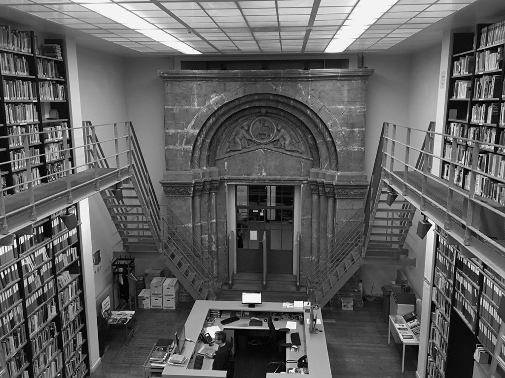
Picture: I took the feature picture in Dublin during IFLA 2022.
Note: There is a note about fonts used on this site in the Colophon.
Updates: Added FontLibrary to Fontsquirrel (both sources of free fonts), 15 June '23.