The library website
At the AMICAL2023 conference recently I spoke about libraries and the relational turn. In the collections-based library, services, organization and spaces are configured by management of the collection. In the relational library, services, organization and spaces are configured by changing patterns of research, learning and public engagement [pres, video].
In this environment, the library is no longer an informational pitstop, rather it provides a range of services throughout the lifecycles of research, learning and civic engagement. This acknowledges that in a network and digital environment the effective production and use of information is not discrete and outside these behaviors, rather it is integral at all stages. Think of research data management, or reference management, or, in a public library setting, services for local authors or for Newcomers. (Calgary Public Library discussed below has a Newcomers Desk.) These services are created in partnership with other players on campus or in the municipality, and may evolve in deep and extended consultation with users.
A challenge for the library is that its identity and perceived value is still very much bound up with the collections-based library. Which in turn entails a rather static, external view of information.
In this environment, the library is no longer an informational pitstop, rather it provides a range of services throughout the lifecycles of research, learning and civic engagement.
This gap in perception highlights the critical importance of storytelling about the library, its developing role and its positioning. The library's strategy, for example, is an important opportunity to tell stakeholders – staff, users, and funders – the library story. By story here, I am meaning a communicated awareness of what it sees as important to it, in terms of direction, understanding of user needs, inclusivness. In fact, this seems a rather important strategic emphasis. This is not straightforward, as traditional views of the library are very entrenched.
One important venue for storytelling is the library website. The library website evolved from the collections-based library, foregrounding the collections search box and providing a layers of signposts over services. Of course, the collections search box is important, but it is also very important to show that the library is much more than that.
Many libraries do extensive UX work, develop user personae, and so on. There are certainly challenges in presenting the library as a unified service, especially where one is stitching together outputs from various services (libguides, discovery layer, ebooks, online readers, etc.). I am getting at something related but prior, which certainly then flows into UX work. You cannot assume that the prospective user knows what services are available, or what is possible.
There is now an advantage in contextualising and describing more of what the library does, more actively motivating and promoting its services, and considering modern design and layout as part of storytelling intent, to draw in users. I have been interested to see signs of a shift towards this more integrated website narrative, mapping user needs and telling a more holistic story about what the library does and can do. We are seeing a trend to the narrative website.
In this short entry, I briefly note three library websites which I have come across recently which illustrate this trend. These are: Utrecht University Library, Calgary Public Library, and the University of Ottawa Library.
I am not saying that these are the best or necessarily exemplary, rather that they are indicative in various ways. Two of the libraries are Canadian, and one is Dutch. I don't believe their location is significant in the context of this post. All that links them is that they are good examples I have come across recently.
Web-sightings: storytelling and the narrative website
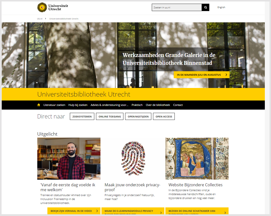
Utrecht University Library
Utrecht is admittedly untypical in that it has decided to move away from a discovery layer, so there is not a search box in prime real estate space. Instead, it uses a combination of third party services linked back to local collections, which is described here. Also of note is that the library is a visible link on the University home page, one of just 5 on the prime navigation bar.
The website leads with a news item against the background of a full width image. There is some navigation, including highlighted direct links to search engines (interpreted broadly) and to open access, which as part of open science generally is a major focus of the library. Then there is further news and events, illustrated by photographs. A sense of energy and engagement comes through, especially given the dynamic nature of this content.
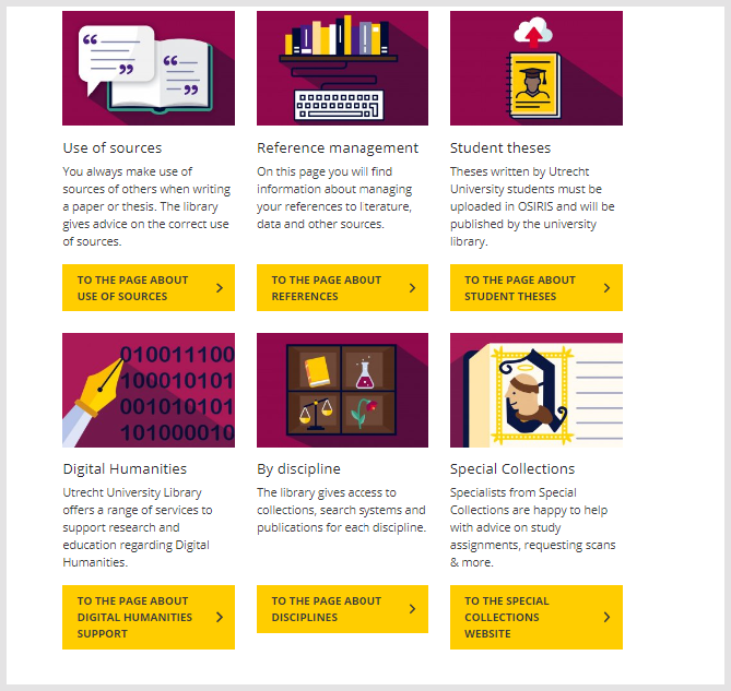
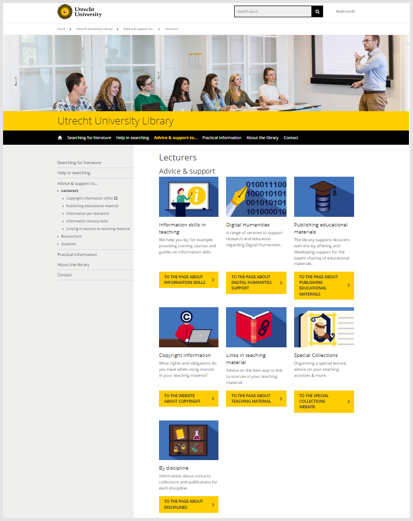
What most struck me though was the way in which they described their service offer, using a three-fold distinction: for researchers, for students (learning) and for lecturers (teaching). Rather than a list of services, linked to separate pages, they have a page each for researchers, students and teachers. Each page then contains nicely illustrated panels describing available service areas. These are linked directly from the home page and also from an 'Advice and support to ...' page.
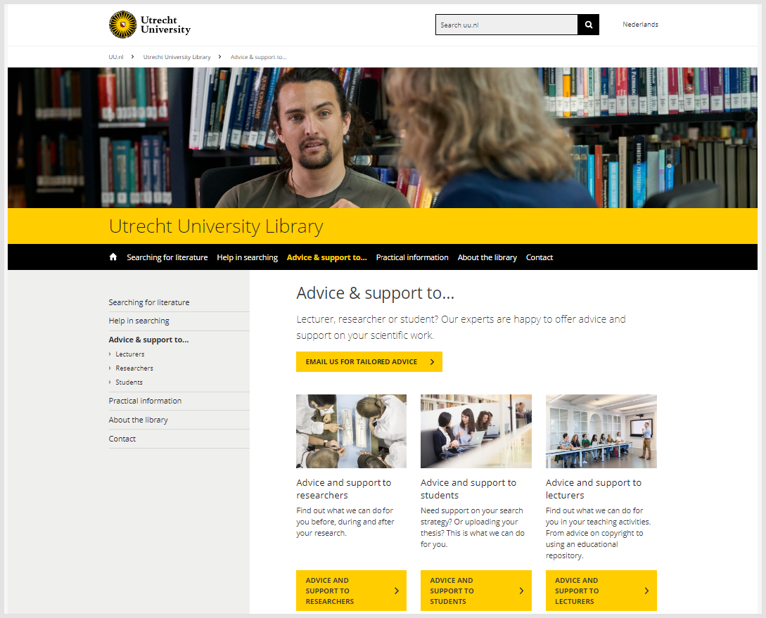
What is nice here is that each is accompanied by a sentence or two indicating the type of support provided. It is couched in terms of jobs to be done throughout the lifecycle, not as a particular service name, or in terms of access to informaton.
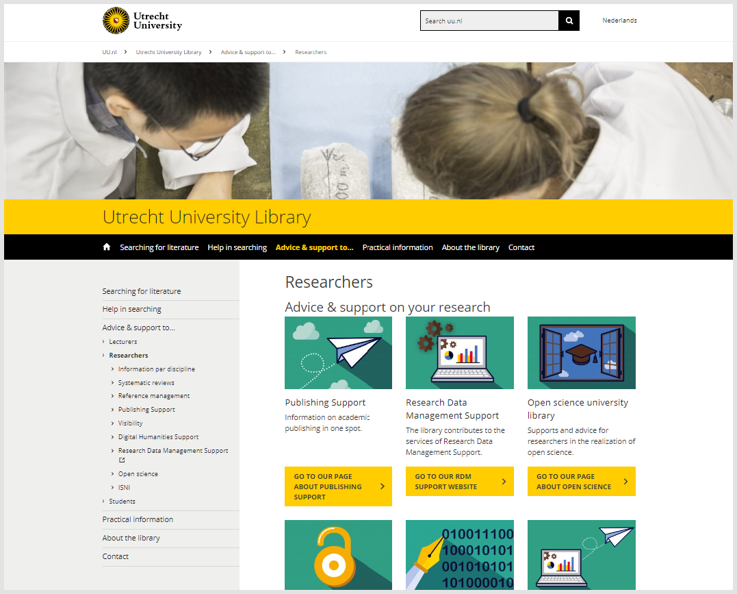
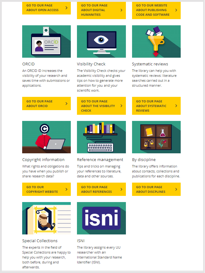
Research advice and support
The areas for support are also presented with a short contextual paragraph. Again, they are organised around jobs to be done. So it brings together advice and support on publishing "in one spot." It offers a 'visibility check' which steps through ways in which you can draw attention to your work on the web. I like how the emphasis is on both advice and support, so help is available whether or not there is an immediately applicable service. In this way, the library is emphasising its general expertise and contribution, rather than a particular set of named services which may be more or less well understood.
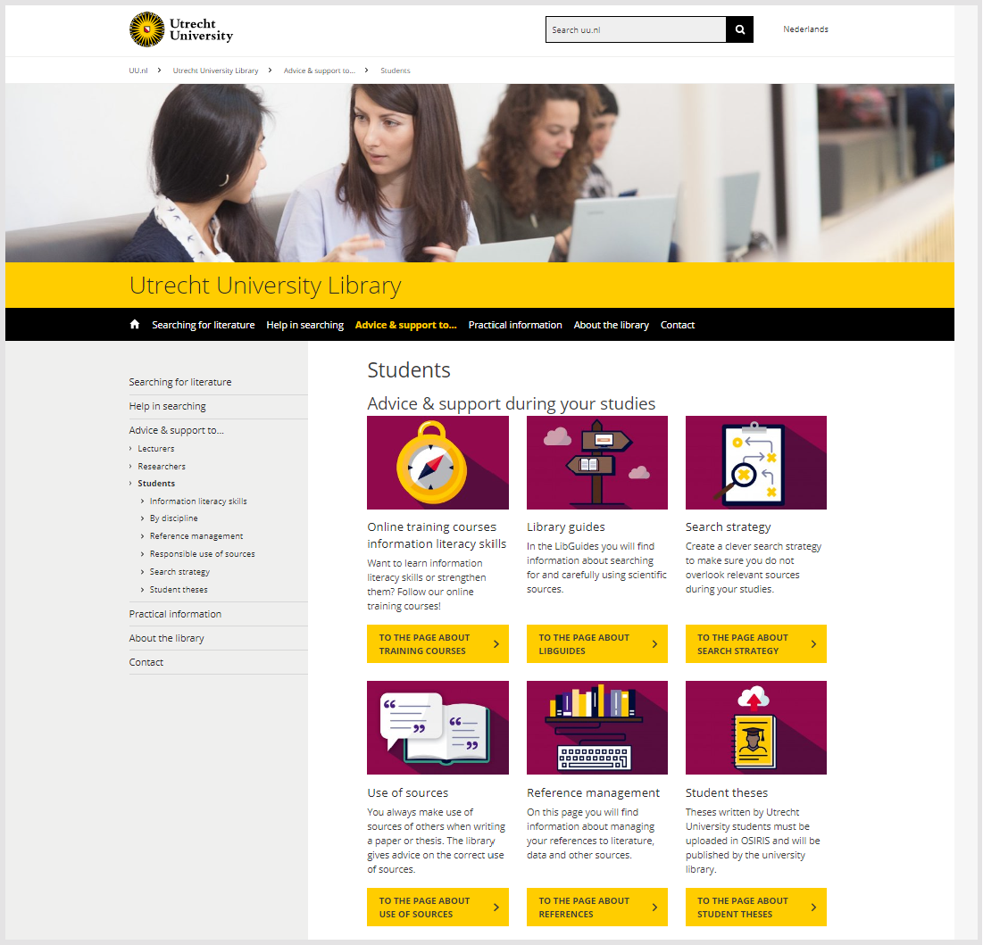
Learning and teaching advice and support
Learning and teaching are presented similarly. The areas are color-coded - the graphic panels in each is in a different color - green for research, blue for teaching.
Each panel leads to a more detailed page which discusses the topic and may provide further resources. There is some contextualization. So, for example, a panel for special collections appears in each area, but the brief description is specialised each time to the group it is aimed at.
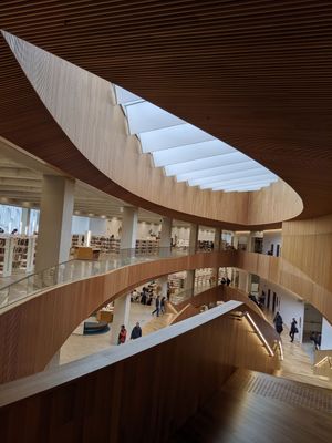
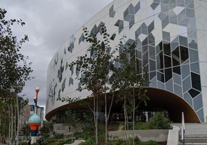
Calgary Public Library
I wrote admiringly about a visit to the Calgary Central Library a few years ago. I recently looked at the website.
Where public libraries are part of local government (as in the UK or Ireland, for example) they usually need to fit in with the website of their parent, which can be somewhat dull. However, in different organizational contexts, public libraries have control over their own websites. And given their general public audience are often brighter and more directly engaging than academic sites. More relational.
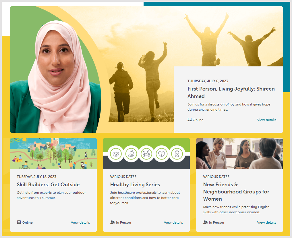
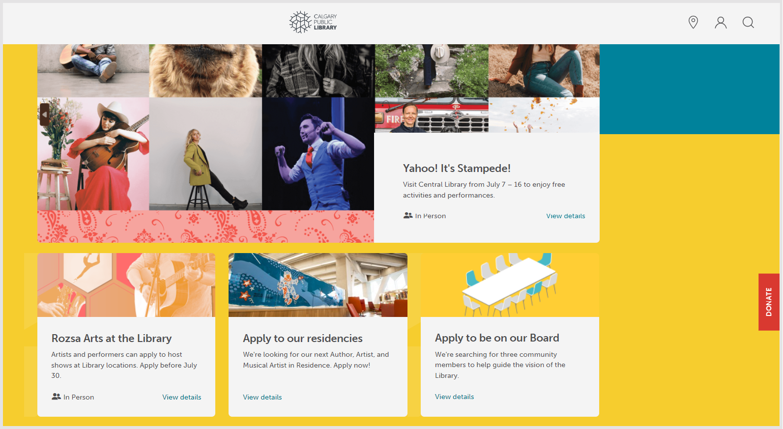
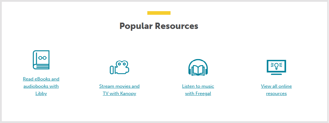
There is much to appreciate on the Calgary website. The immediate impression is contemporary, informative and engaging. The focus of the home page is the Summer program. Then it has a hamburger on the left which expands into four equally emphasised sections: Your library which provides overview information about the library, its locations and volunteer opportunities (I like that 'your'); Connect which introduces ways to connect with expertise and facilities; Events & programs which introduces opportunities for social engagement; and then Read, learn & explore which introduces the collections, the digital offerings and the central library. There are icons on the top left for search, locations and profile. The search page offers a search of either the website or the catalog. It may be a small thing, but I thought that overall these options reflect people's experience of current websites, and it was good to find the catalog under a general search icon.
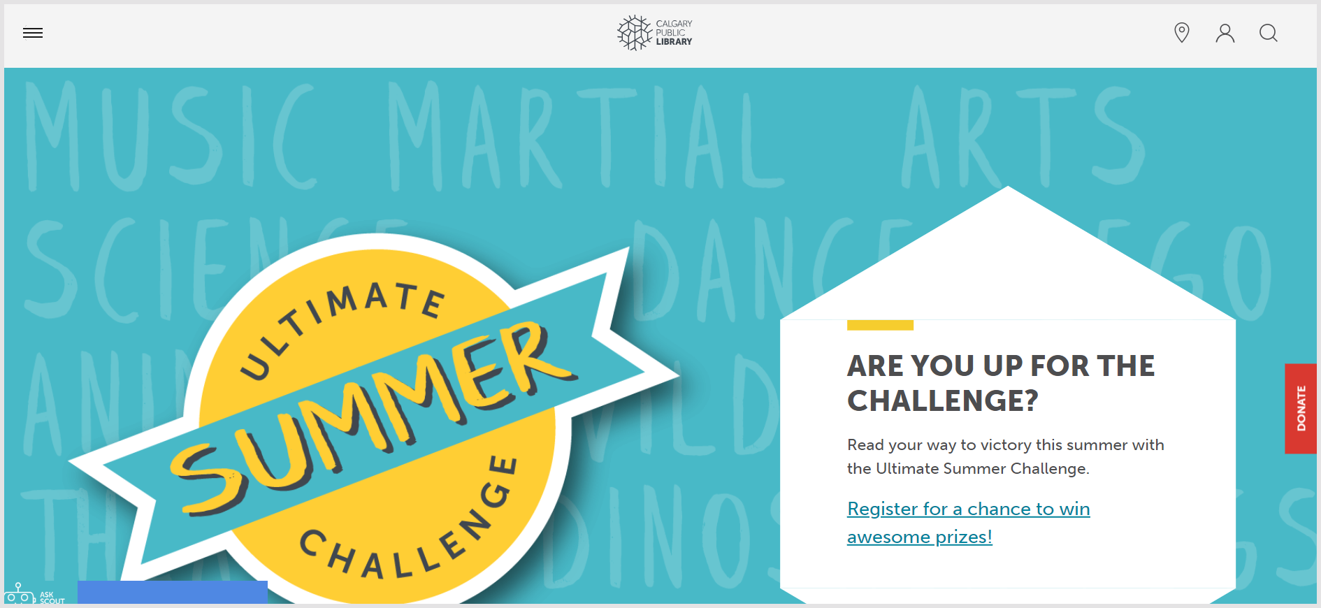
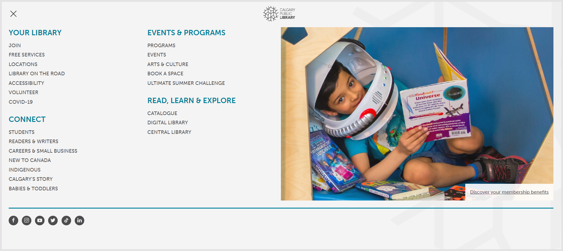
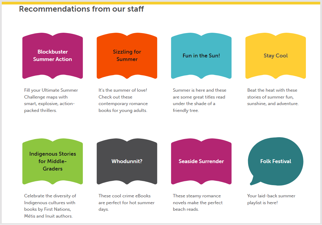
The rest of the home page continues to be very bright and engaging. Events and tailored reading recommendations follow, again with short contextualising descriptions.
There is a variety of ways in which users can participate in the library, including being on the Board. It is interesting to see how the Board opportunity is presented at the same level as other activities and services. It emphasises partnership with, and accountability to, the community.
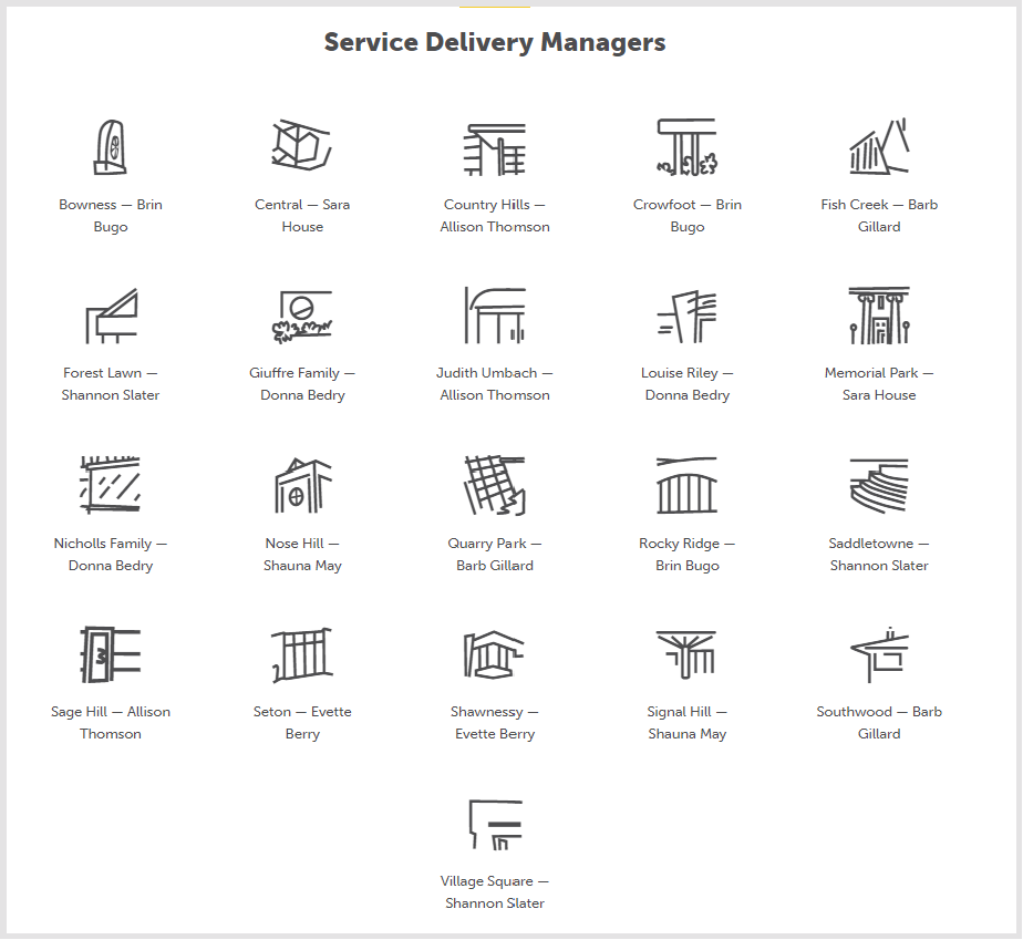
I liked the icons for media types and loved the graphic representations of the individual branch libraries on the people page, nice to look at but also glanceably informative. There are actually also photographs of the branches on the locations page.
Icons throughout ... not just lists of services
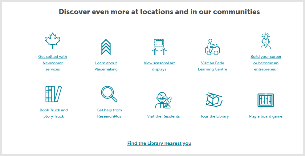
In the context of my theme, the pages that struck me most were those about joining and services. This is where the library says who it is for and what it does. The message is of an organization which recognises the plural communities that actually make up its community. And note again pictures, color and a contextualising sentence.
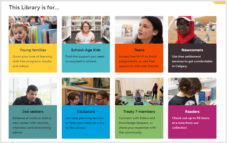
The services page describes a range of services, including support for mental wellness. I like the way it describes the books: yes these are important but we do so much more. This is presented positively. And not in the defensive, negative way that one sometimes hears "we are about more than books."
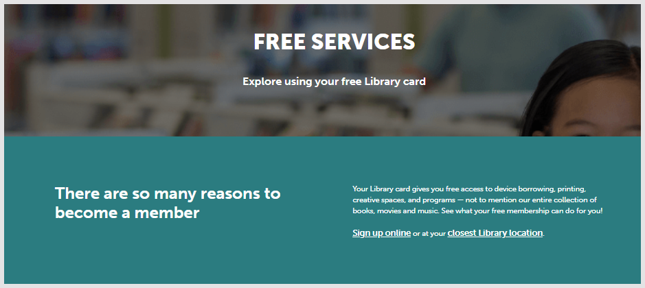
This page is also actively making the case for joining the library, not just describing services. This is characteristic of the website as a whole - it feels active, it wants to engage and to provide opportunities for participation.
This is characteristic of the website as a whole - it feels active, it wants to engage and to provide opportunities for participation.
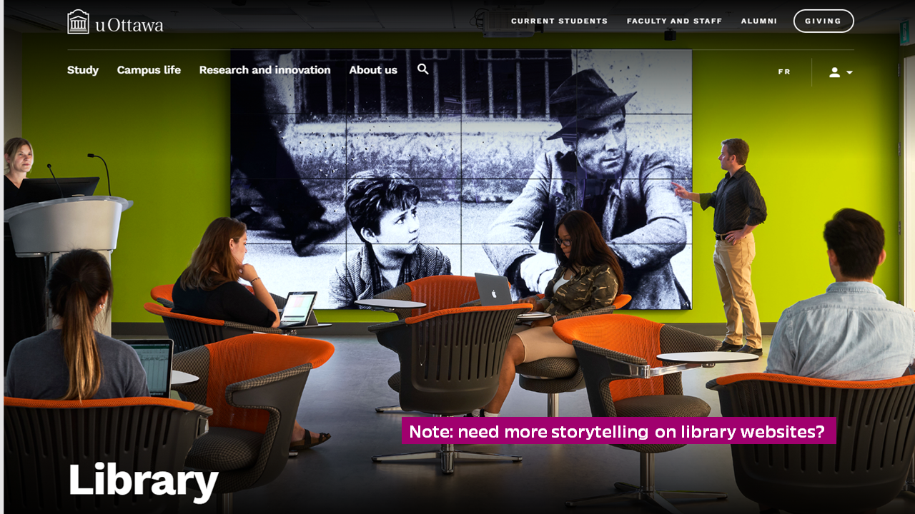
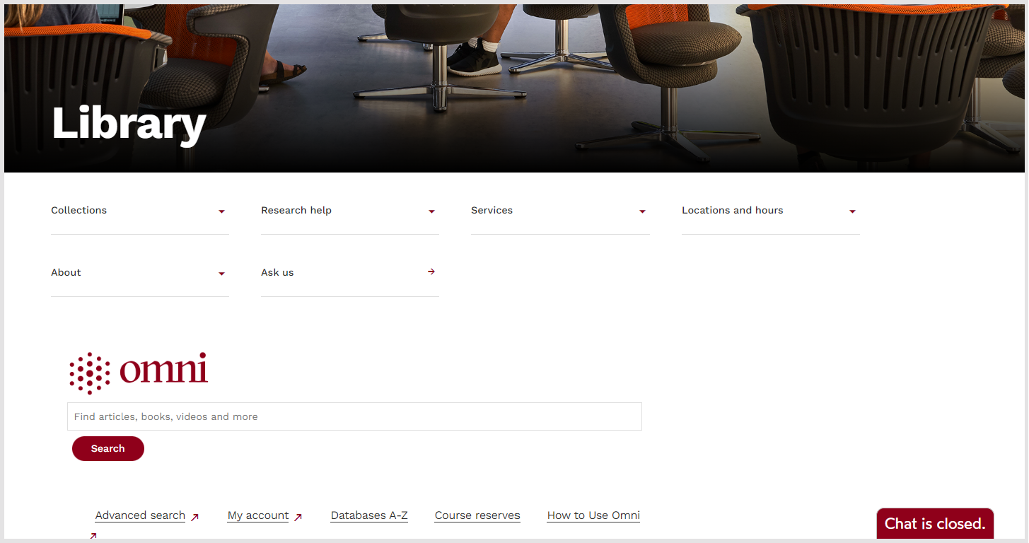
The University of Ottawa Library
I came across this when looking for library strategies, of which the University of Ottawa Library has a nice example. I was immediately struck by the full-screen warm and bright picture (see above), showcasing the teaching and social nature of the library. The website itself has extensive use of white space, a generous font-size and well-chosen complementary fonts, which gives it an open expansive feel. Again, it feels current. It inherits these choices from the University, and one slight drawback is that it is sometimes easy to confuse the general university navigation in the header and footer with the library's.
The picture is followed by high level navigation, and by the Omni search box. Omni is the consortial search system to which Ottawa belongs.
The navigation labels are not too surprising but I liked their centrality and also some of the choices made in how services are aligned under them.
Collections covers both what I call outside in (materials acquired by the library and made available internally - books and journals) and inside out (materials owned or generated by the university and shared with the outside world - special collections, digitised collections, research outputs). I appreciated how these were lined up together, and how the repository material was lined up alongside journals and articles. See the panel on the left here:
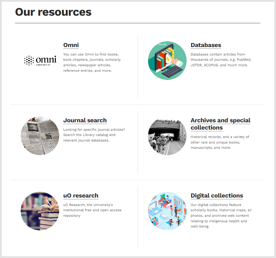
Again, note the picture and contextualising description
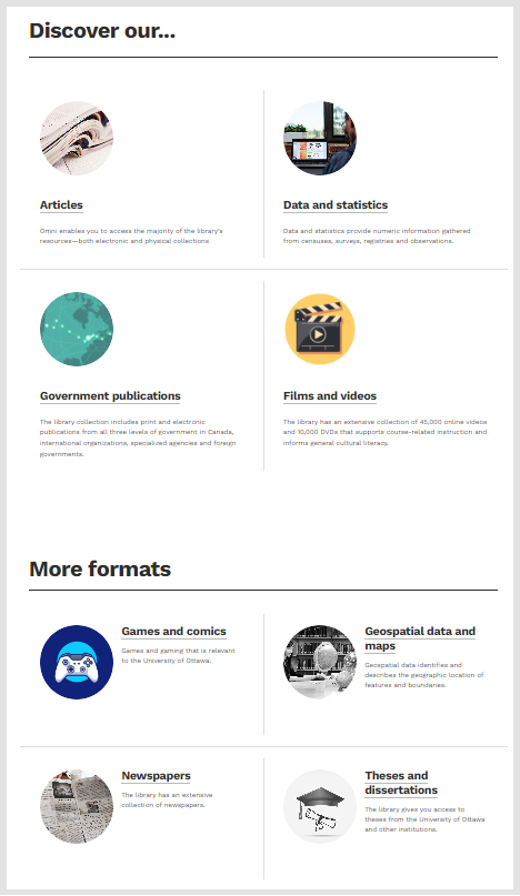
They also go into a little detail about the types of things you can find in the library (see the panel on the right above). I like that they do not take it for granted that potential users will know what is in the collections and they spell some things out.
Research help also seems purposefully organised, and not just a list. Research is a somewhat elastic word on library websites. In the collections-based library, it tended to be used to refer to aspects of literature-based research, and this sense still occurs. Now, as support is provided throughout the research lifecycle it tends to be used more broadly to describe a range of services, as it is here. The set of services includes the use of resource guides, and also support for writing and citing (I think that 'research skills' is a positive and strong term), but also include research data management services, data services and scholarly communication services. Each item opens out on a page with more resources, with a focus on education, awareness, service and further contact as relevent. Services are contextualised in terms of research and learning behaviors.
Services is a list of areas with some focus, not exclusively, on learning and teaching. Again, pages open out to advice, education, services. Here for example is the hero section from the course reserves page ..
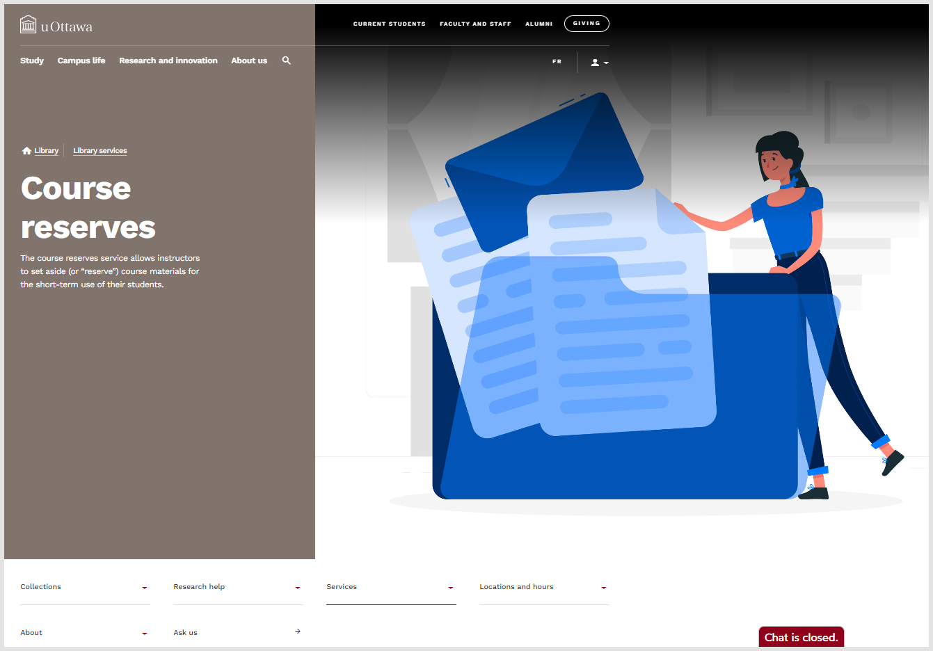
This shows several things:
- The University header navigation is on very page. It includes links to student portal, course management system, and employee portal, and to general pages for employees and students.
- It also includes the high level library navigation below the picture, and a link to chat.
- There is occasional use of this trend-conscious flat style of illustration throughout the website (see the Corporate Memphis trend). The title (course reserves) appears in a panel, with some context. The content of the page follows below.
Library strategy - An outward view
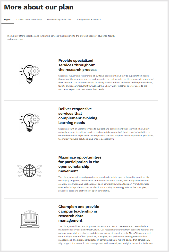
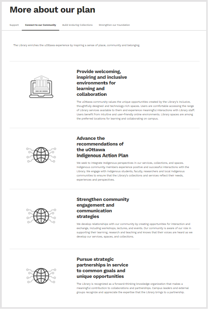
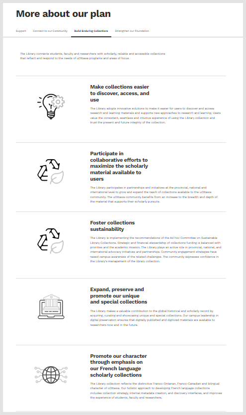
I mentioned the library strategy, which is highlighted in the About section. It is very much a storytelling document, which aims to show that the library understands and is responding to the research and learning work of the university. This is from the introduction by the University Librarian, to the careful keying to University objectives, to the overall structured presentation. The focus thoughout is outward facing, on participation in the work of the university and on partnership in advancing programs and services. Of course, this has to be balanced with an emphasis on the library and its contribution.
Each of the libraries is careful to describe itself in terms of what the community it serves values, not in terms of internal capacities or structure.
The language is carefully chosen. Services are specialised and they are provided throughout the research process. Services are responsive and complement learning needs that are evolving. Space is for learning and collaboration. The collections objective is not just focused on the locally acquired collection. It notes how collaboration maximises availability, and connects activities with sustainability goals and with the 'distinctive Franco-Ontarian, Franco-Canadian and bilingual character of uOttawa.'
The library mission is pretty direct and clear in what it thinks is important. It highlights the connections to university strategy and how it improves research and learning at the University. And it leads by connecting first to expertise, and then to services, collections and technology.
In alignment with the ambitious vision and core aspirations of Transformation 2030, the uOttawa Library advances cutting edge research and supports transformative learning by connecting the uOttawa community to expertise, services, collections and technology in a welcoming and supportive environment. // Mission
Again, the overall impression is of a library which wants to understand how it can help its researchers and learners succeed, in whatever ways it can. Nothing leaps out, but text and presentation is symptomatic of a relational attitude.
In its own way, each library shows a commitment to telling a well-grounded story, in which the library is an active partner in enhancing learning, research and civic engagement, and overall community wellbeing.
Some general observations
Here are some general observations looking at the three websites together.
- In each of these cases it seems to me that the library purposefully starts with a more holistic view of the library and its position. Each also recognises that it cannot assume that users already understand all they ways in which they can participate in library services. In the relational library, full library discovery becomes a starting assumption as one wants to describe and promote all the ways in which the user can participate. The library does not want to assume that a potential participant is already familiar with the variety of ways in which they can benefit from expertise and services.
- Each of the libraries is careful to describe itself in terms of what the community it serves values, not in terms of internal capacities or structure.
- The narrative briefly describes the job the service or potential services can do for the user, rather than just naming or listing them. The 'curse of knowledge', where too many assumptions are made about what the user knows, is avoided in this way.
- Advice and education are emphasised as much as actual services. The library expertise may be manifest in different ways.
- I mentioned that the library strategy was an important vehicle for storytelling above. The current library strategy is very visible in each of these cases, and again is presented very much in storytelling terms. It is purposefully a public communications document, as well as an internal guide. These libraries want their users to understand their story, what is important to them, where they are investing their energies [Utrecht pdf; Calgary pdf; Ottawa]. More generally they share information about the library and its organization.
- They recognise the importance of a human face. Generally and also in leadership positions. Calgary has a full people page with photographs (all with the Central Library in the background, and also includes links to branch managers. I like the welcoming picture of the library director on the Ottawa strategic plan, and they have a leadership page (without photographs) and routes into librarians and specialists who can help with particular needs. Utrecht describes the organization of the library and provides contact points (with photographs).
- Website design is fresh with good use of spacing, color, typography. There is generous use of pictures, whether it is screen-width photographs, contemporary-style illustrations, and graphics associated with descriptions. The University websites inherit design from their parent institutions, but in each case it works well. These websites, in particular Calgary and Ottawa, are much more like the general informational websites people are accustomed to. I found myself saying and thinking 'it feels designed' quite a bit when looking at these sites, and I realised that much of what we see appears less so, or seems routine.
- News and events are important in different ways and tend to be highlighted. Events offer participation opportunities, are often the result of partnership, and signal commitment to shared experiences. A river of news shows activity, and also offers up more text for discovery.
- One area which I think will be increasingly important, but which is not highlighted in these libraries, is the digital exhibition. These contextualise and highlight particular strengths or unique materials. They place collections in a narrative which connects them with community and broader interests. They tell a story about the value of collections in terms of research, learning and community sensemaking.
In its own way, each library shows a commitment to telling a well-grounded story, in which the library is an active partner in enhancing learning, research and civic engagement, and overall community wellbeing. They are good examples of the narrative website.
I wrote about the National Library of Sweden in the fonts post, noting how the strong font choice helps create coherence across the website and enhances its storytelling.
Coda: a note on two related trends
I think that effective storytelling in the context of the relational library will be increasingly important. There are two related and overlapping emphases, and I think all three together point to evolving re-evaluation of library website positioning.
- Generative AI applications comprehend, summarise and generate text, which, in concert with search technologies, will cause a step change in discovery services. When your content management system comes with an AI-enabled conversational interface, how do you best characterise what you do and offer for good results? Contextualising services in relation to user needs and more fully documenting what they do will be helpful from a discovery point of view. What we might call the documentary website becomes important. (To get a sense of what this may look like, the perplexity.ai plugin/service is very useful: it allows you to scope a query to your own website.)
- The pandemic focused attention on the online experience. It underlined the importance of having a more holistic online experience, where the full range of services is available and described. I have spoken about this as an important pandemic effect, as in, for example, the RLUK presentation linked below. I used the recently redesigned University of Michigan Library website as a good example. This nicely shares many of the narrative characteristics I mention above. And as I discuss in the presentation, it provides a very full overview of the capacities of the library, again in a way that is focused on research and learning needs.


Picture: I took the feature picture on a trip to Calgary.
Acknowledgement: I am grateful to Ken Varnum for helpful comments on an earlier draft.