
I was in our local Border’s just now, forlornly looking for a weekend Financial Times. Not finding one, I was looking around aimlessly. A couple of things caught my eye, where one mode influences another.
One of the nice things about Border’s is that you can look for items on their ‘catalog’ in the store. I was amused to see a paper note hanging on the catalog screen: this is not a touch screen. I wonder did they have this issue before the iPhone and the devices it has influenced?
They also have occasional sections on the shelves where they display a book alongside several similar ones. They suggest that if you enjoyed reading the displayed title that you may also enjoy the several others that they place alongside it. I wonder are the recommendations generated by their sales data, or are they hand-picked by staff?
Share
More from LorcanDempsey.net

The narrative website: from signposting to storytelling
As we move from a collections-based to a relational library, storytelling becomes very important. One trend is the emergence of a stronger narrative or storytelling emphasis on websites, which helps position the library, promote its services, and address specific interests.
16 min read

Font choices, values and ecosystem, with some national library examples
Typefaces and fonts are functional. However they also contribute in other ways - to brand, to atmosphere, to feeling. This is a brief introduction to aspects of the typeface ecosystem. I combine this with some commentary about how typefaces are used in national libraries to provide context.
44 min read
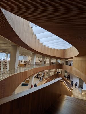
Calgary Central Library: combining intimacy and civic statement
The Calgary central library was on first impression the finest public building I have been in for years.
3 min read